Unifying a family of brands for an e-commerce retailer that creates unforgettable experiences from everyday moments.
Spotix and its family of brands is an online e-commerce retailer that enhances both indoor and outdoor living spaces for residential and commercial properties. They create inviting atmospheres for memorable experiences, whether it's relaxing by the fire or cooking outdoors with friends.
I collaborated with the Spotix marketing team to review the visual brand identity and communications, consulting on the overall brand strategy and working with my colleagues on content strategy to enhance the messaging and visuals.
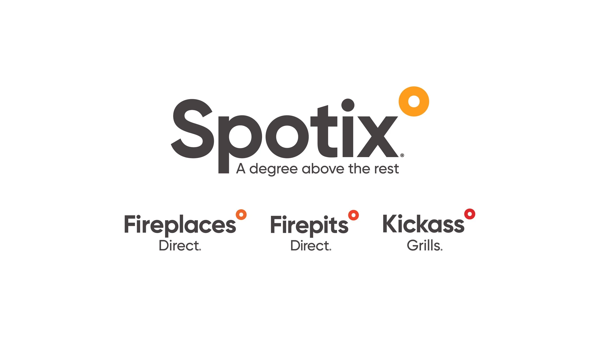
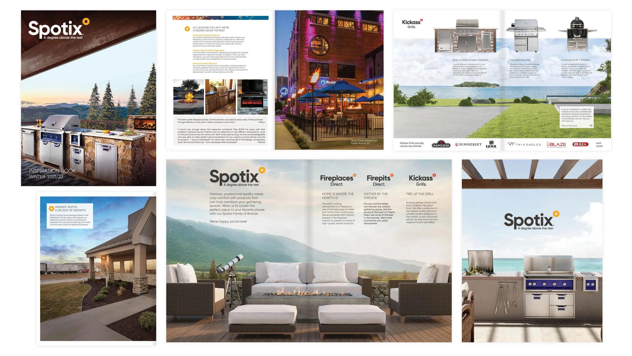
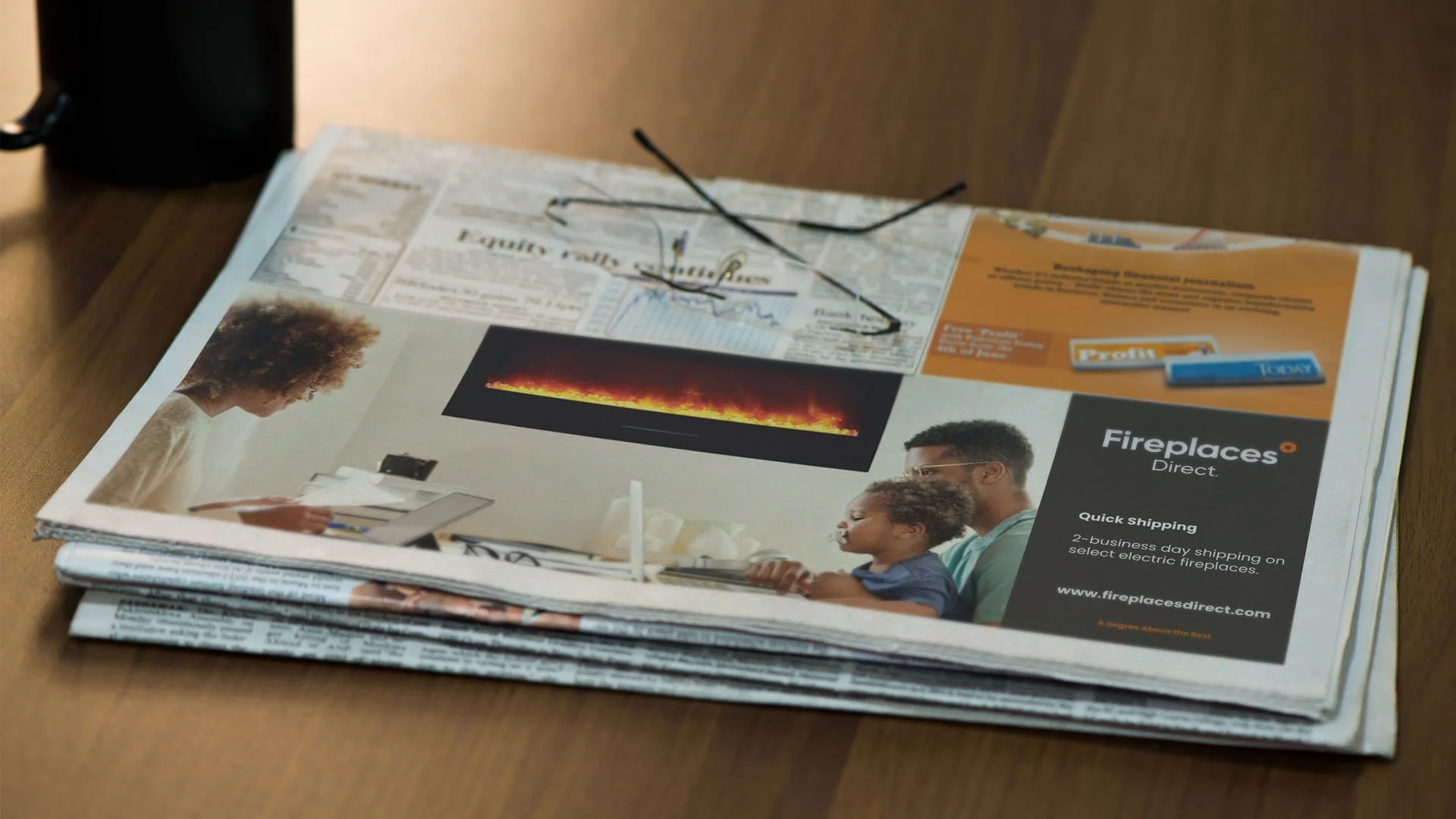
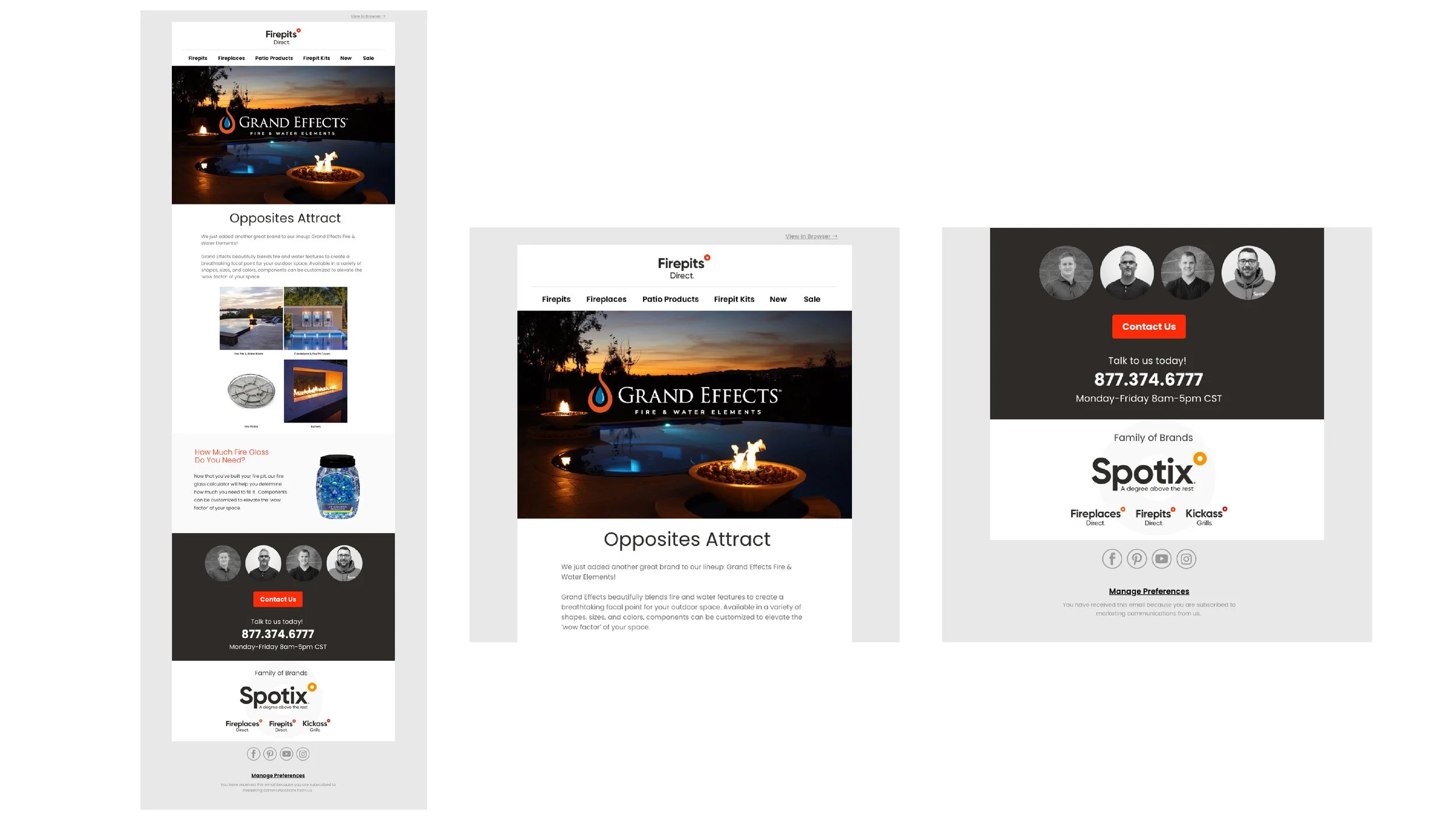
The first initiative focused on consulting, assessing, and redesigning emails for the Spotix family of brands: FirePlaces Direct, Fire Pits Direct, and KickAss Grills. By incorporating premium photography and a new content strategy featuring compelling headlines, promotion visuals, and subject lines, Spotify increased its brand awareness, engagement, and sales.
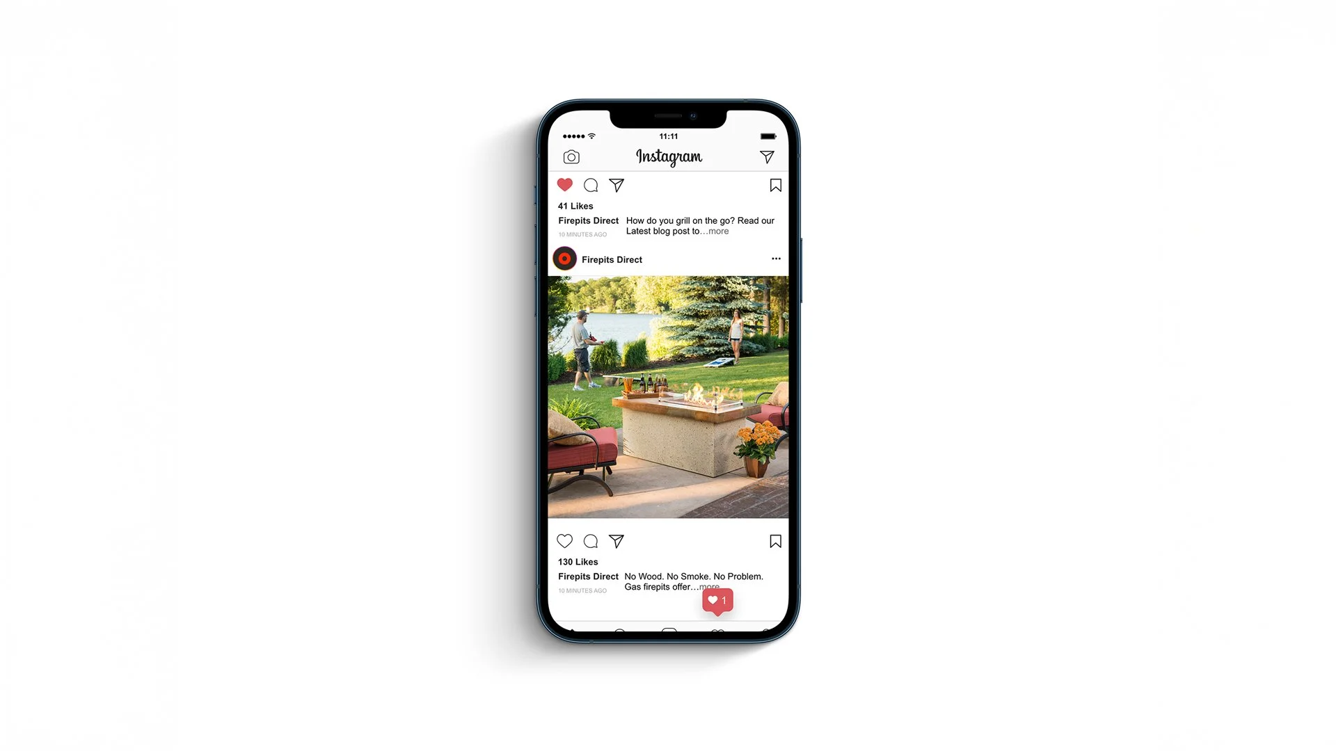
I also collaborated with social media teams to develop organic and paid campaigns, as well as Google Display ads and a blog strategy and design. The visuals spotlight the product, with a clean design for easy readability and clear calls to action.
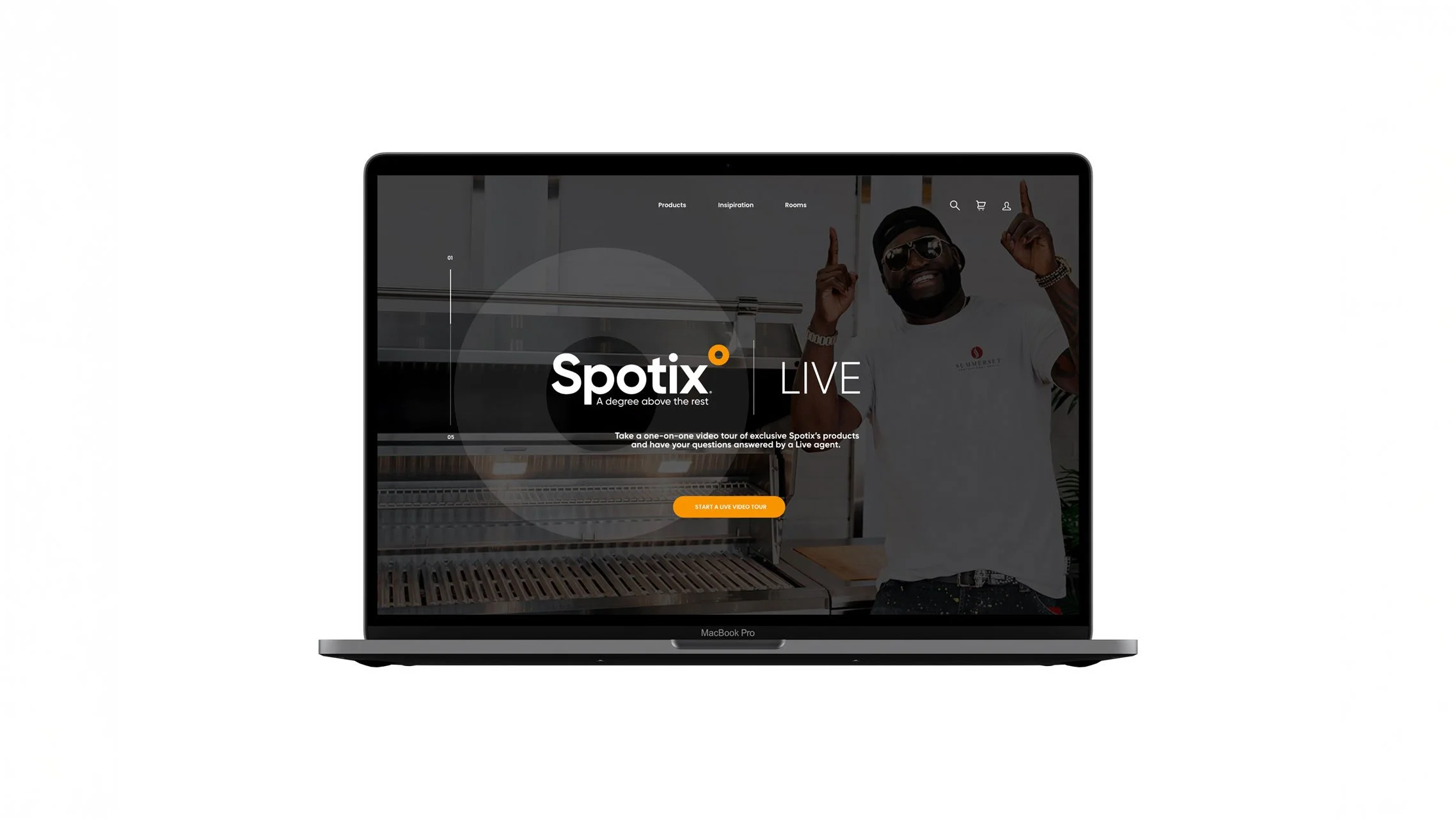
The success of these initiatives led to the rebranding of Spotix and its subbrand families. Through in-depth research and discovery, I delivered a unified brand identity, giving Spotix a defined lane in the hearth, patio, and fireplace industry.
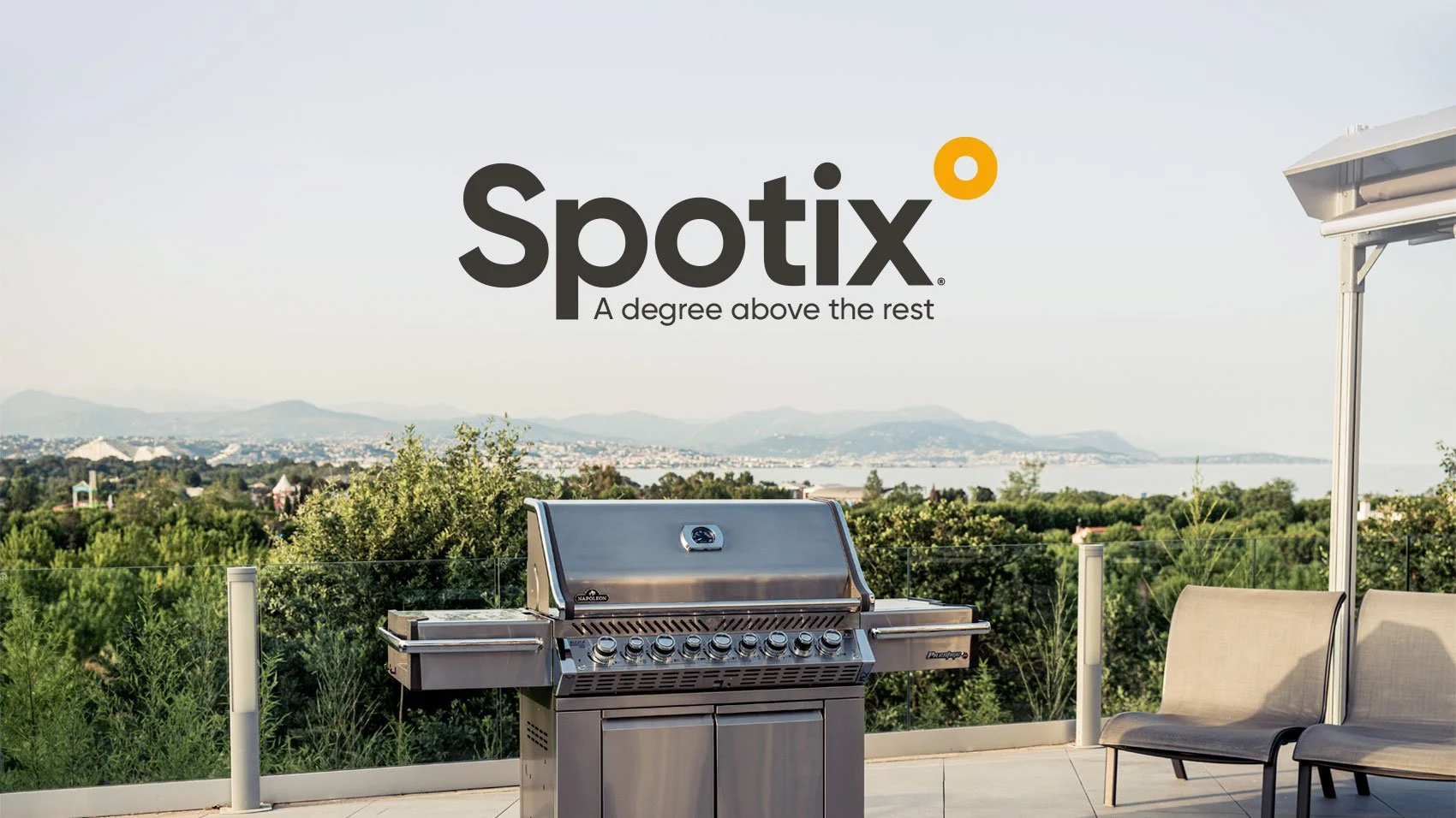
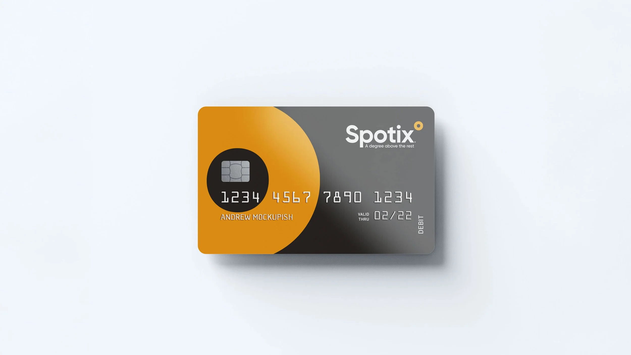
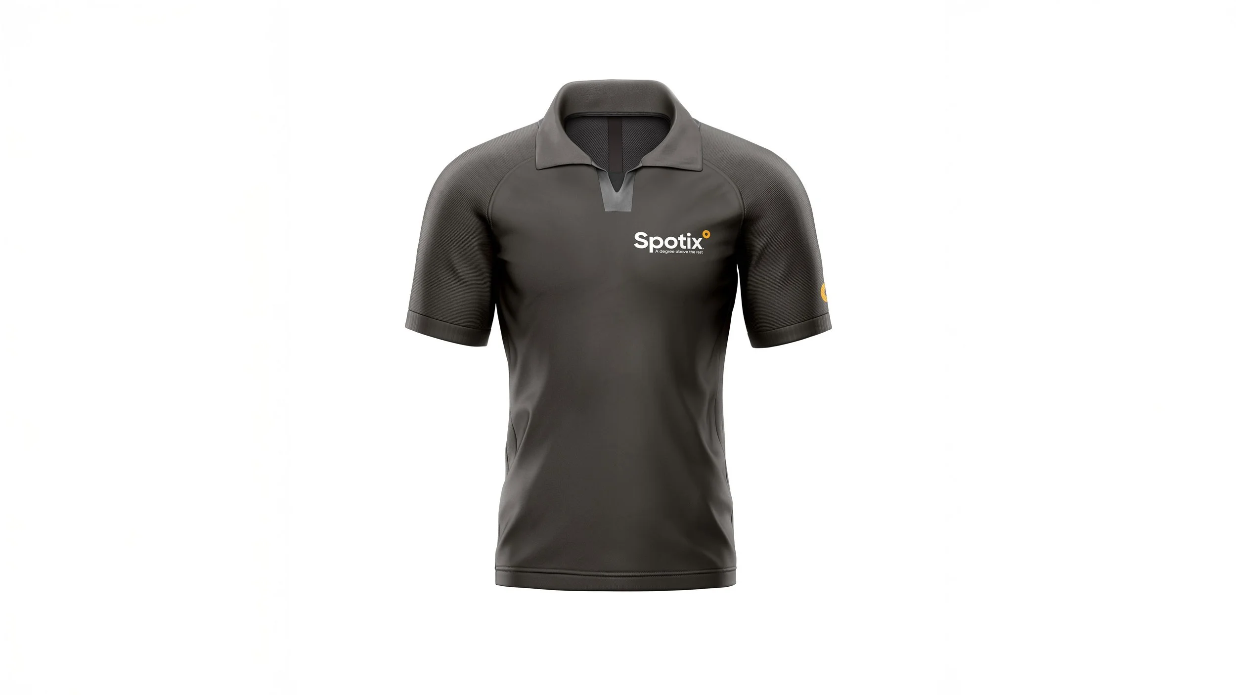
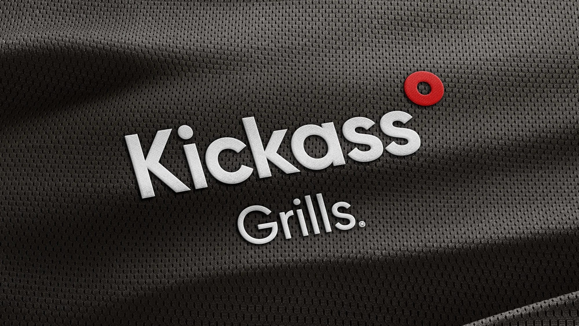
As a designer, I ensure a successful rebrand not only by recognizing competitors but also by setting each brand apart from the industry as a whole. With this client, I discovered most competitors and products use fire and flames in their brand identities. I started by assessing Spotix's former circle gradient, which was drastically different from the sub-brands. To evolve all brands into a cohesive identity, I elevated the circle to complement the "o" in Spotix. This later evolved into a degree symbol, with a subtle nod to heat in Fahrenheit temperatures.
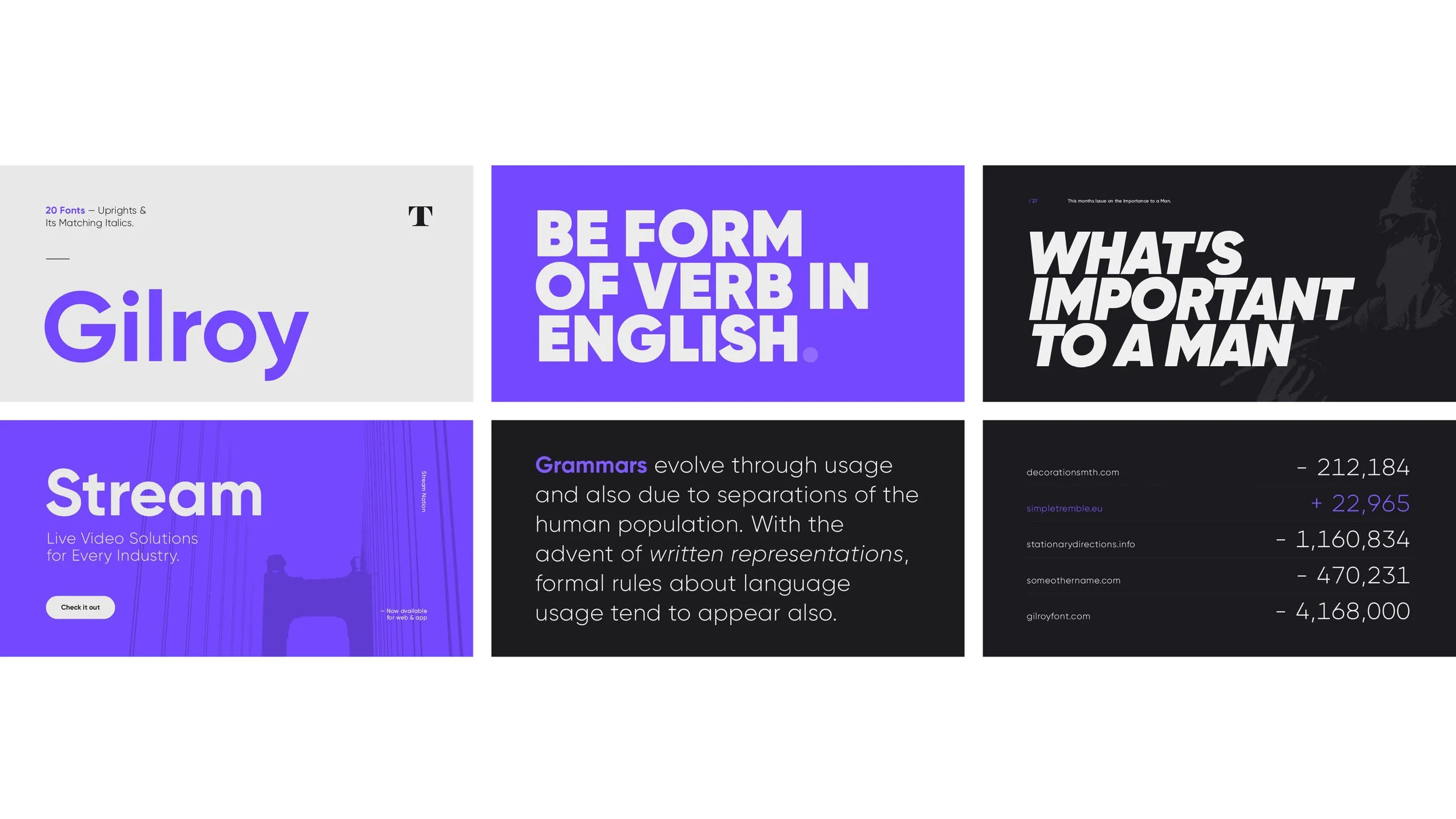
I selected the font Gilroy, a modern, geometric sans-serif font. While Spotix has no physical footprint like the big-box stores, it was perfect for Spotix because of its versatility—not only for large-scale signage but also because it was easy to read and suited for body copy and headline text.
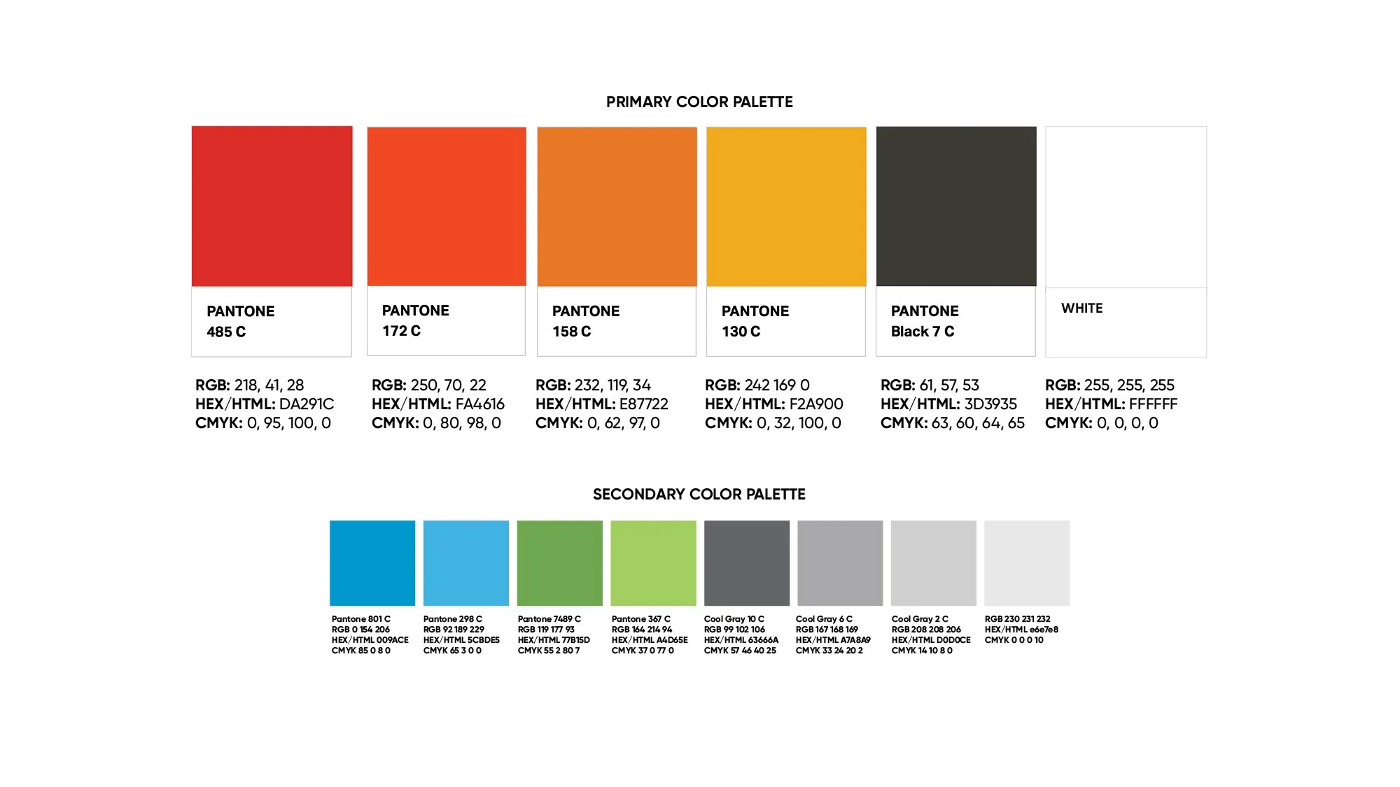
Next, I refined the color palette, leaning into the progression of warm colors and creating a cohesive family of brands that evokes heat. The complementary secondary color palette provides more flexibility for use across various marketing platforms.
I developed and pitched the tagline "A degree above the rest," which highlights Spotix's competitive advantage. This tagline spotlights the simple icon that distinguishes Spotix from the numerous industry flame logos, making it a natural and clean progression that can be easily implemented across channels.
Spotix's new cohesive brand identity enhances the premium products they offer to homes and businesses, creating unforgettable experiences from everyday moments.
Created as lead designer at Meld Marketing.


Google Display Ads
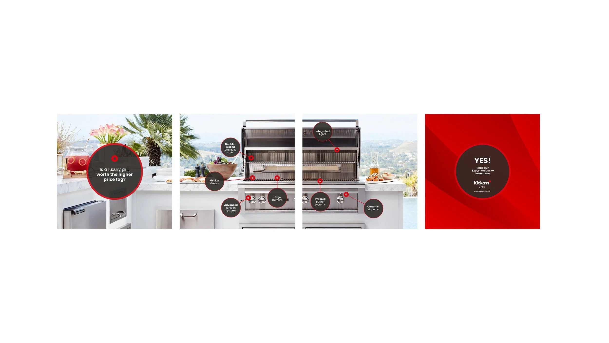
In addition to the rebrand, I designed several display ads for various brands, ensuring the design featured the product prominently, with a clear call to action across varying display sizes.
