Replanting a brand identity focused on providing fresh food to families throughout Eastern Iowa
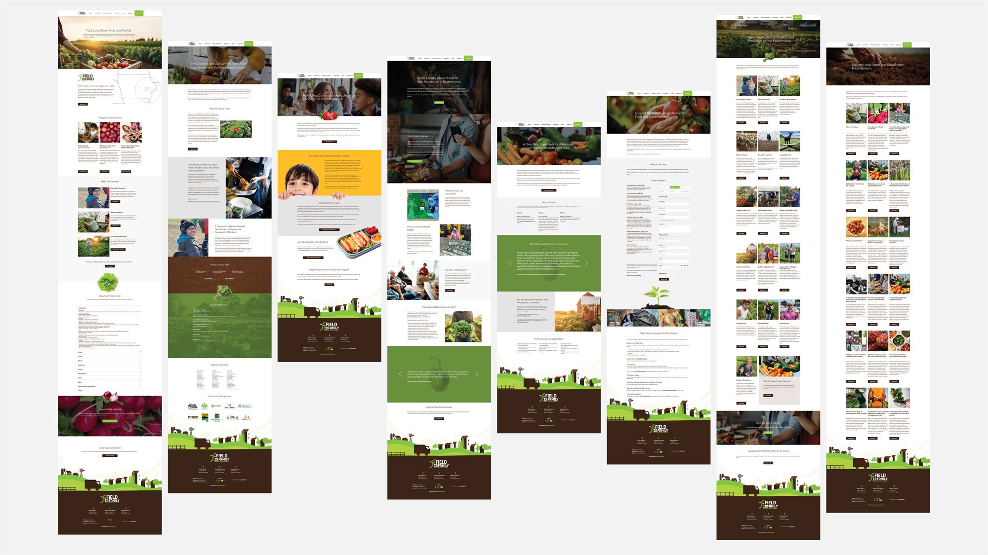
Field to Family's mission is to deliver fresh, local food to families across Eastern Iowa, support education programs, and operate an online farmers market. As their mission grew, Field to Family sought a new brand identity that could clearly communicate its values and scale across all marketing platforms.
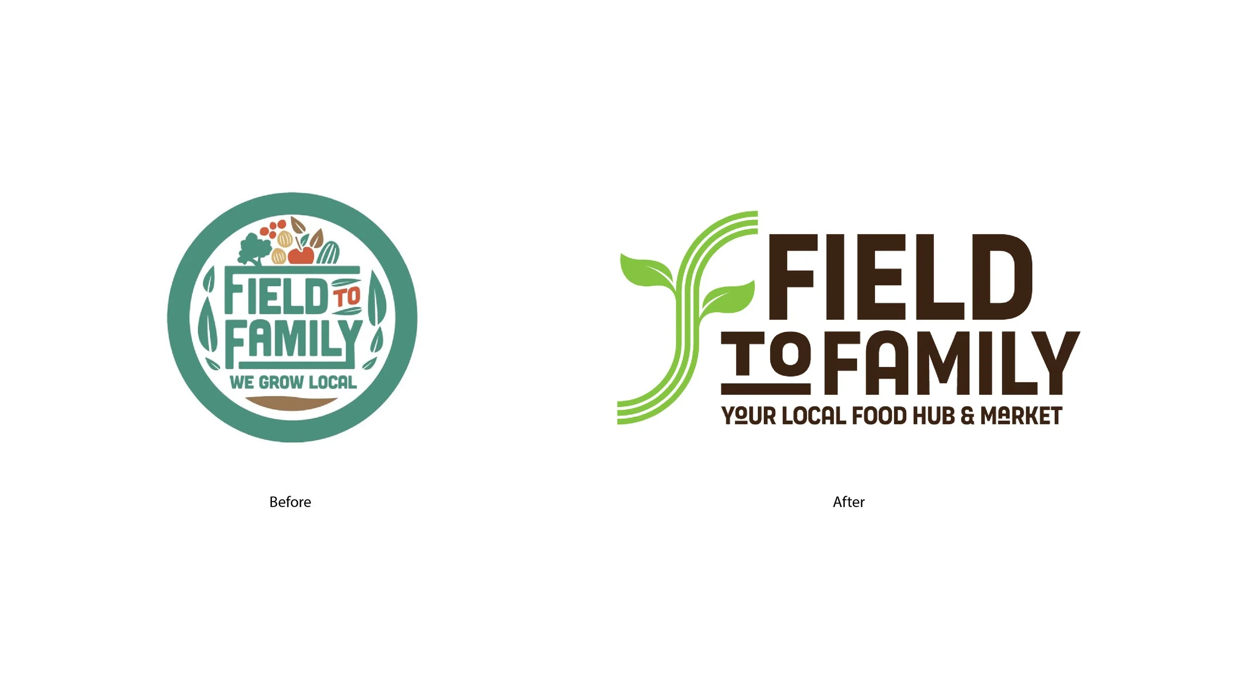
As the designer, one of the most meaningful aspects of the process was listening not just to what the client wanted but also to what they envisioned, struggled with, and hoped to achieve. Their original logo had heart, but it wasn't responsive, scalable, or visually aligned with the richness of their mission and work. The color palette lacked the vibrancy of fresh produce and didn't reflect the connection to the land or the people who cultivate it.
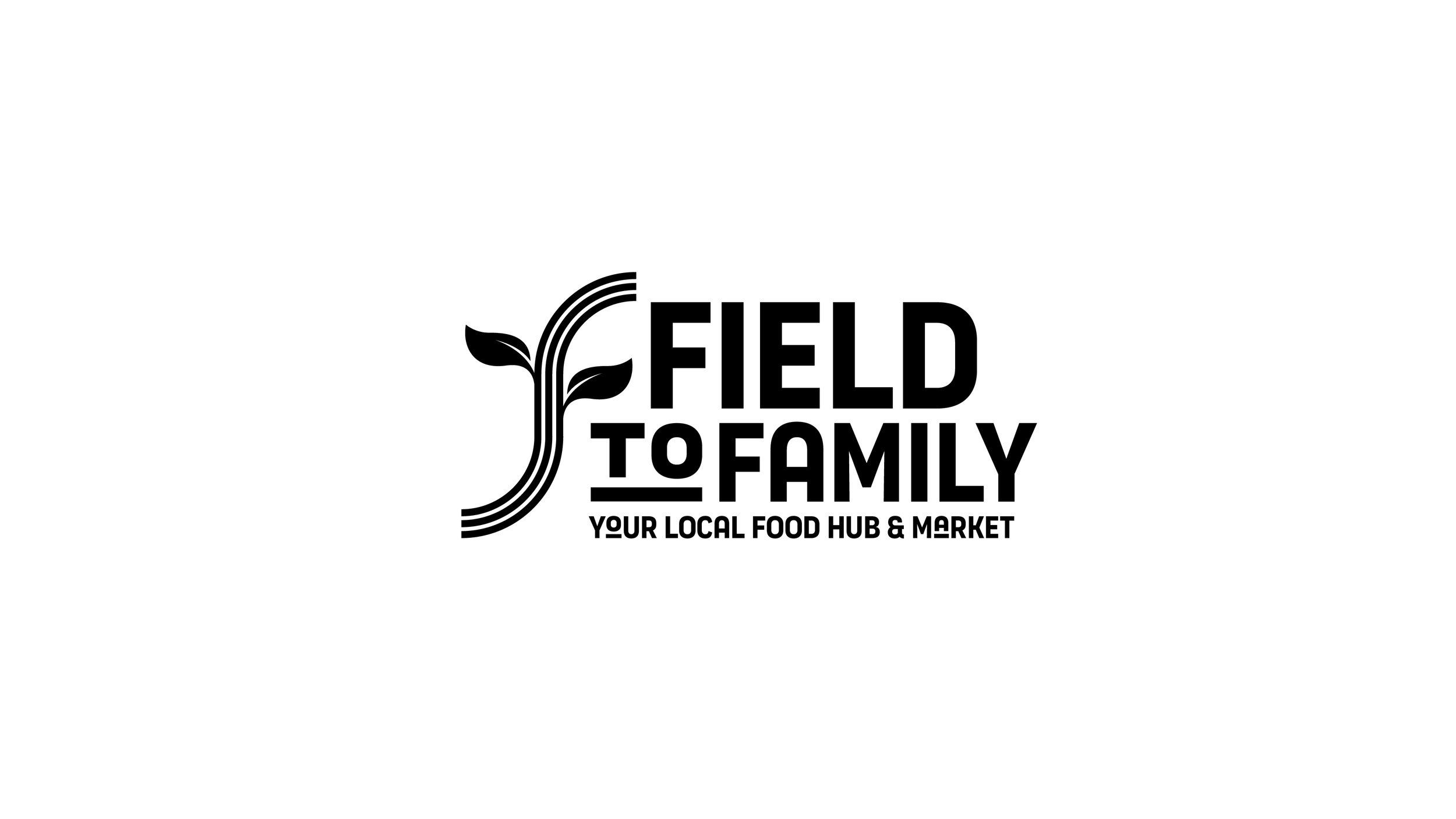
In redesigning the identity, I retained a visual nod to the original leaves, honoring brand equity while introducing a bold new icon: three stylized rows of farmland. Each row is intentional, representing Field to Family's three core goals, showcasing the literal journey from farm to table and the other paths, including education and the online farmers' market.
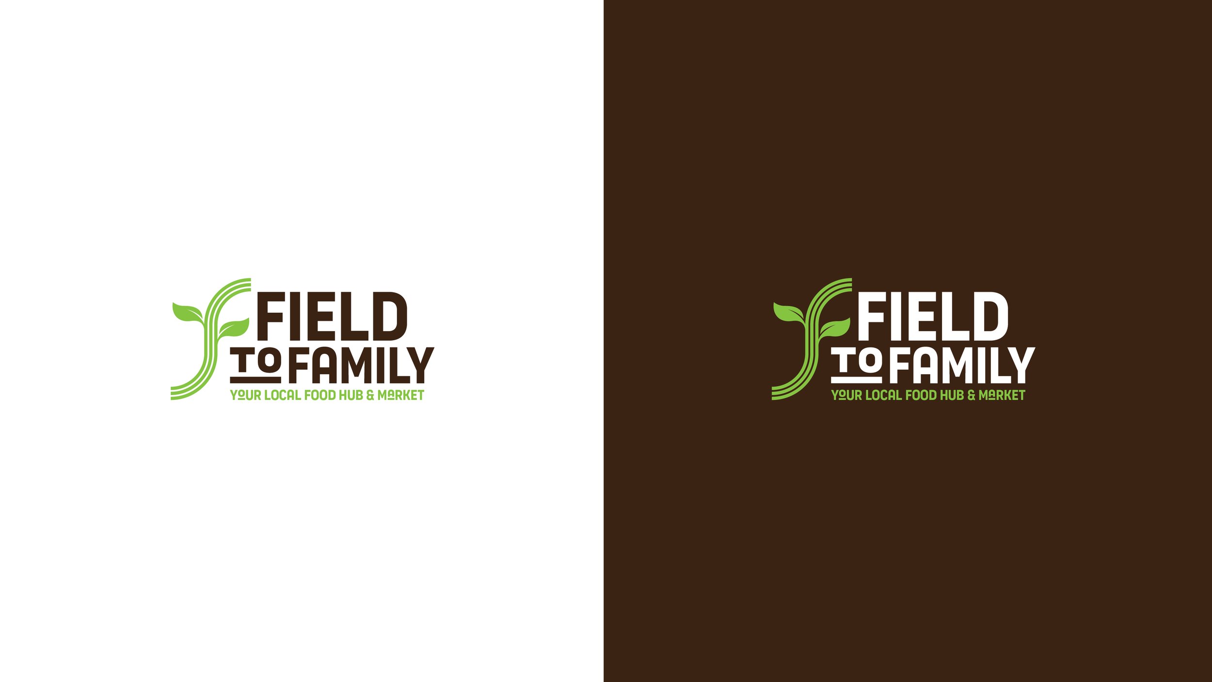
The updated green and brown palette reflects the full lifecycle of produce, from growth to compost, while new secondary colors (orange, red, and purple) expand the system to capture the vibrancy of fruits and vegetables they offer, such as strawberries, eggplant, carrots, peppers, and more.
The result is a brand that feels fresh, grounded, and flexible, built to live across social, web, and print without losing clarity, emotion, and purpose. After presenting the chosen brand identity, the founder said, "I feel seen." That's the power of design when it's rooted in empathy and clarity. It doesn't just look good, it also speaks to the core mission.
Work done as lead designer at Meld Marketing.