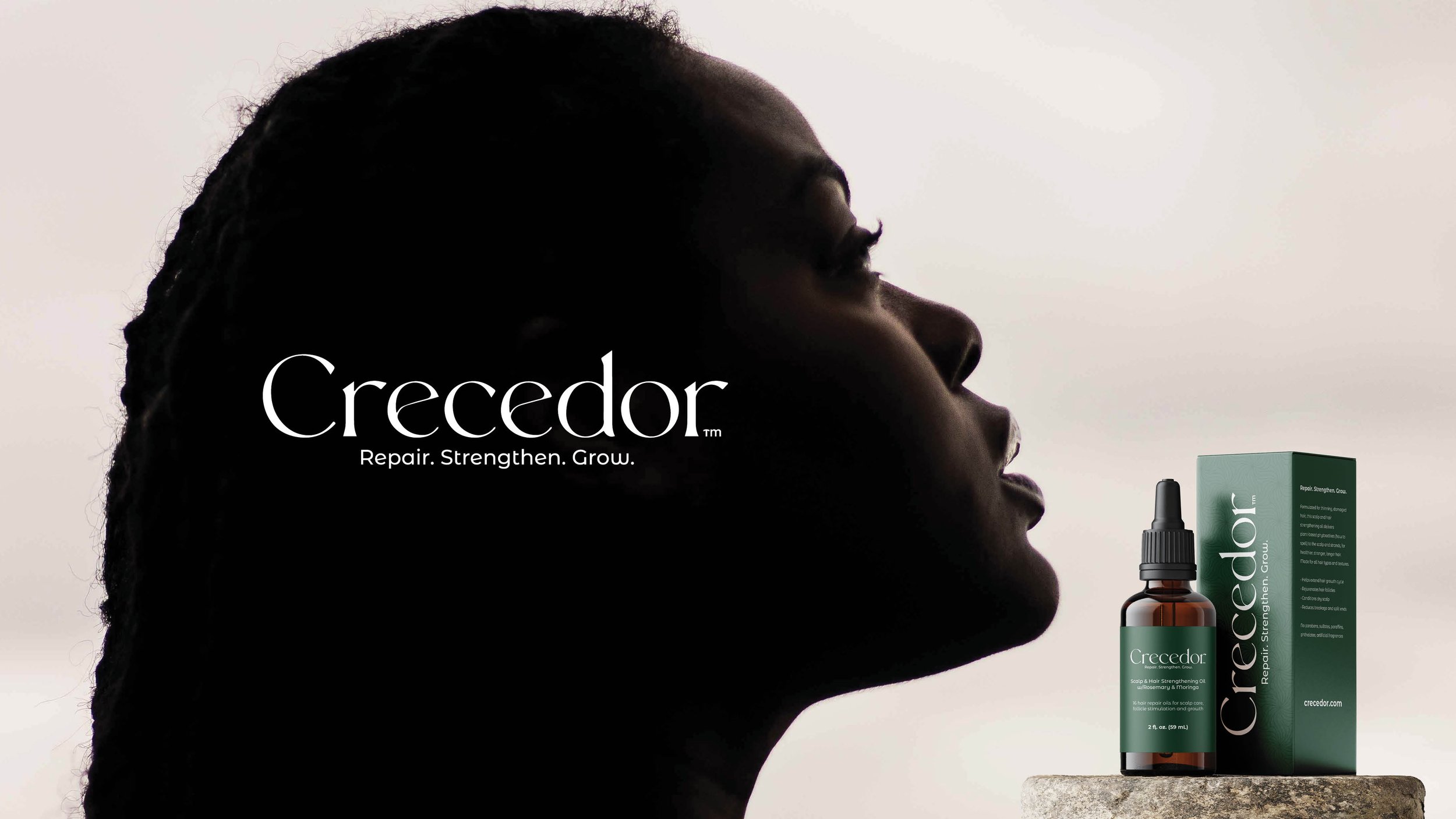
Crecedor: From the Spanish root word, crecer, which means to grow, to blossom, to burst forth
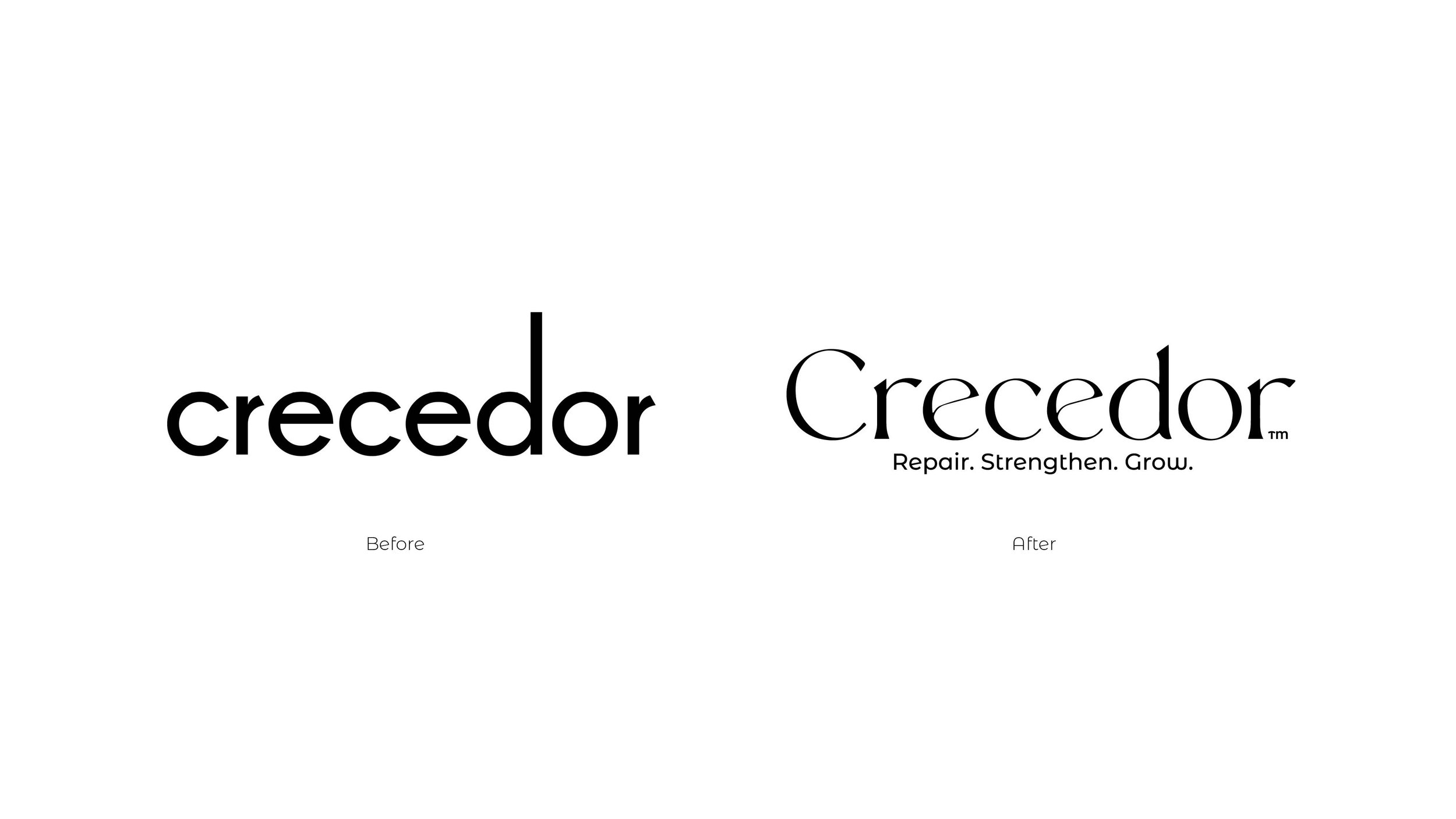
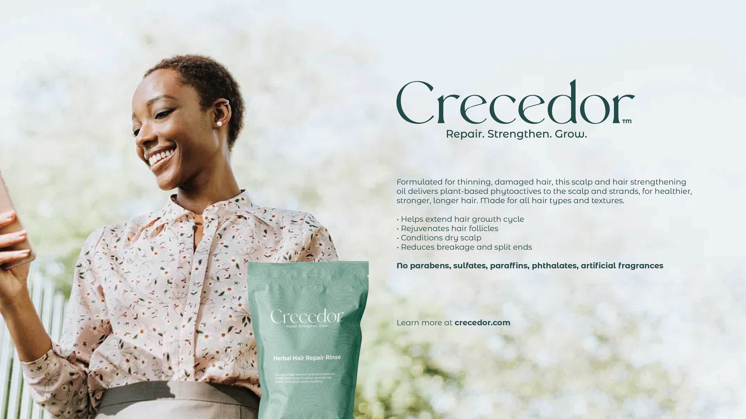
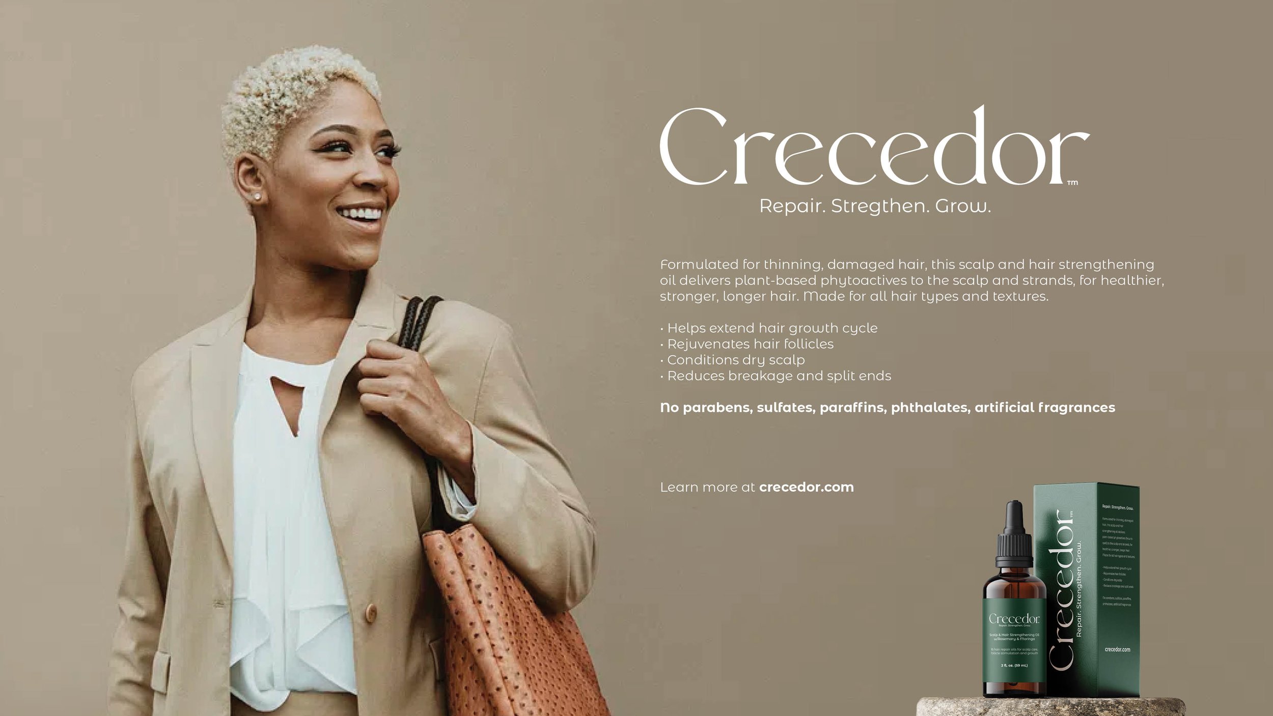
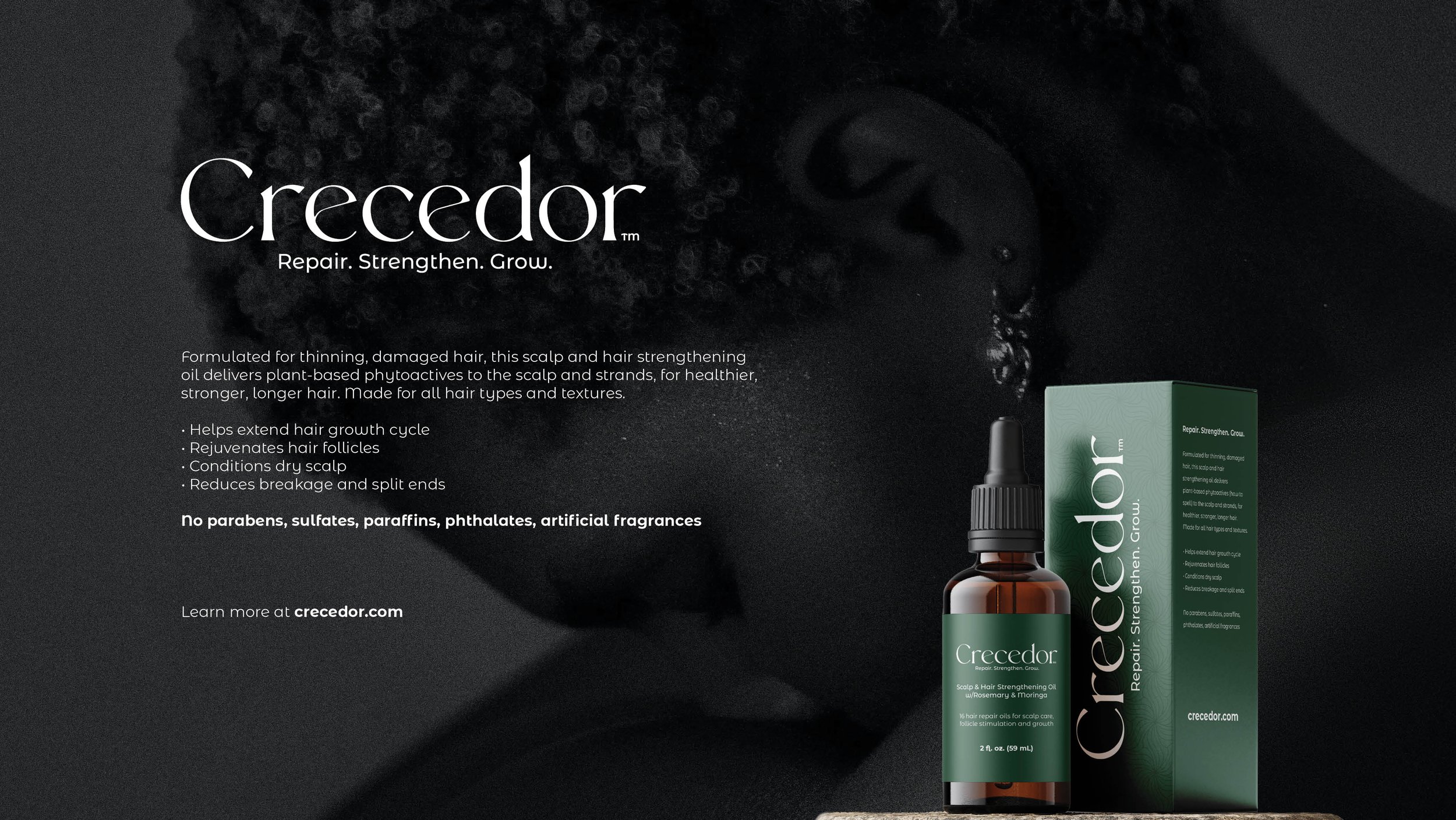
Jason and Melissa approached me to craft a full brand and packaging system for their new product, Crecedor. Melissa's personal journey with hair loss is at the heart of the brand's story. Her dedication to developing a plant-based, chemical-free formula created a powerful foundation to build from. It was clear from the beginning that the visual identity needed to reflect not only the purity of the ingredients but also the care and intention behind the product.
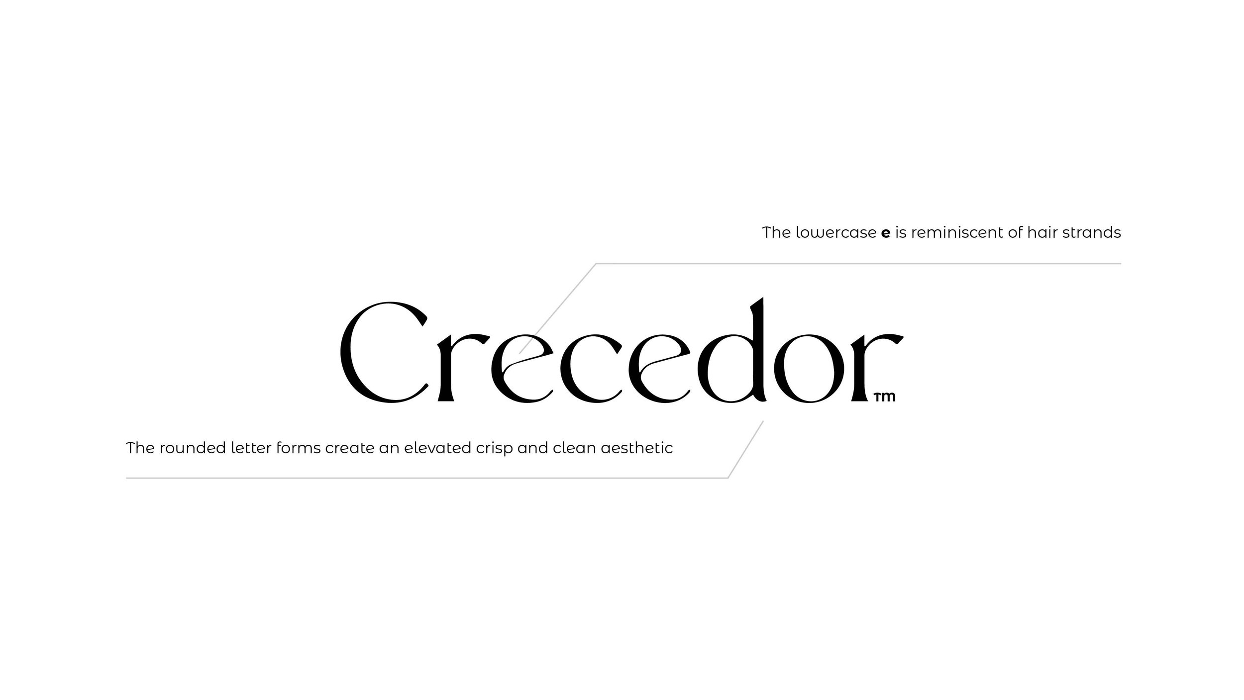
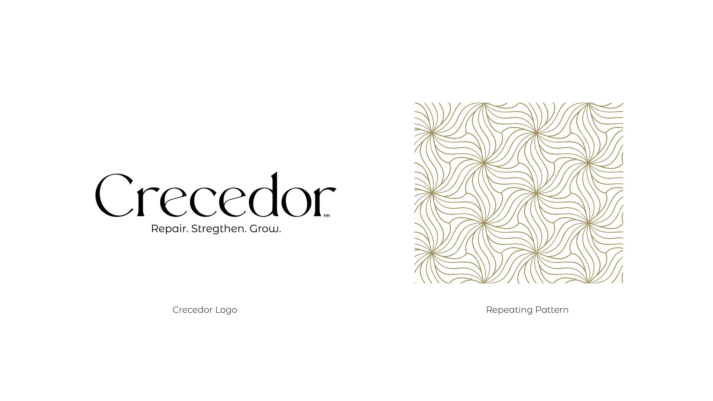
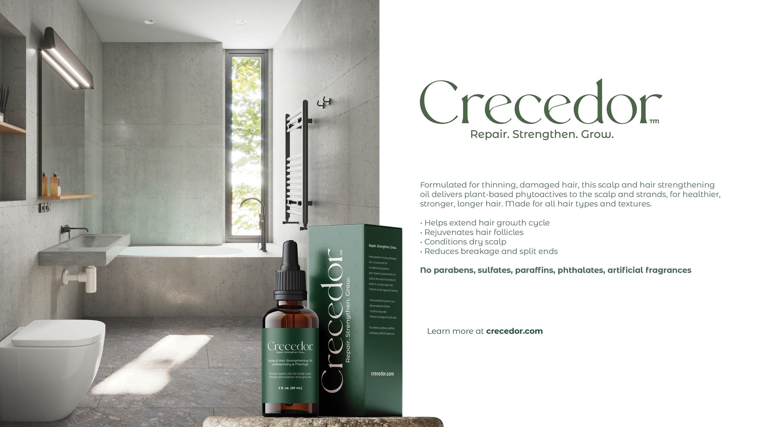
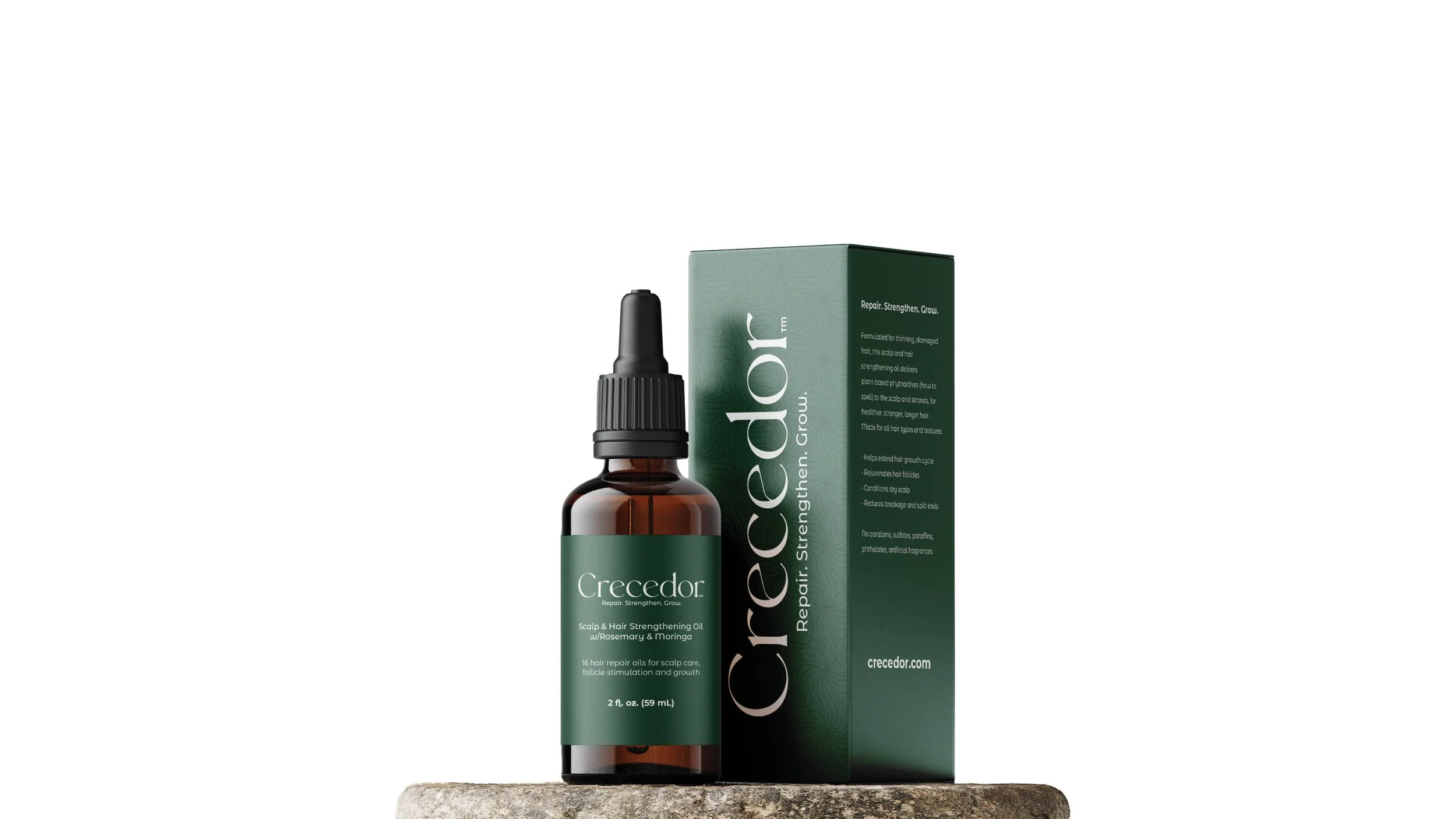
I focused on creating a clean, restorative look and aesthetic, something that felt both modern and naturally inspired. The wordmark-driven brand identity draws visual cues from the product's organic roots, with hair-like linear forms and soft floral tones helping to shape the brand. The color palette was derived directly from the core botanical ingredients used in the formula, reinforcing the plant-based mission in a subtle but meaningful way.
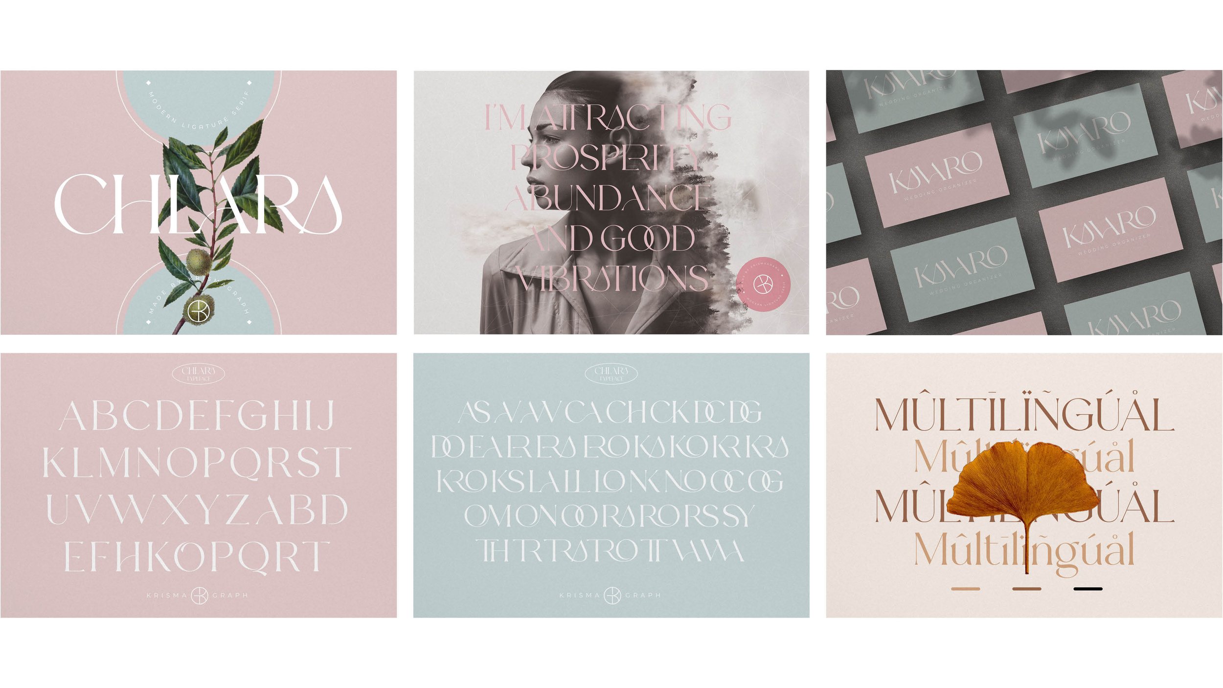
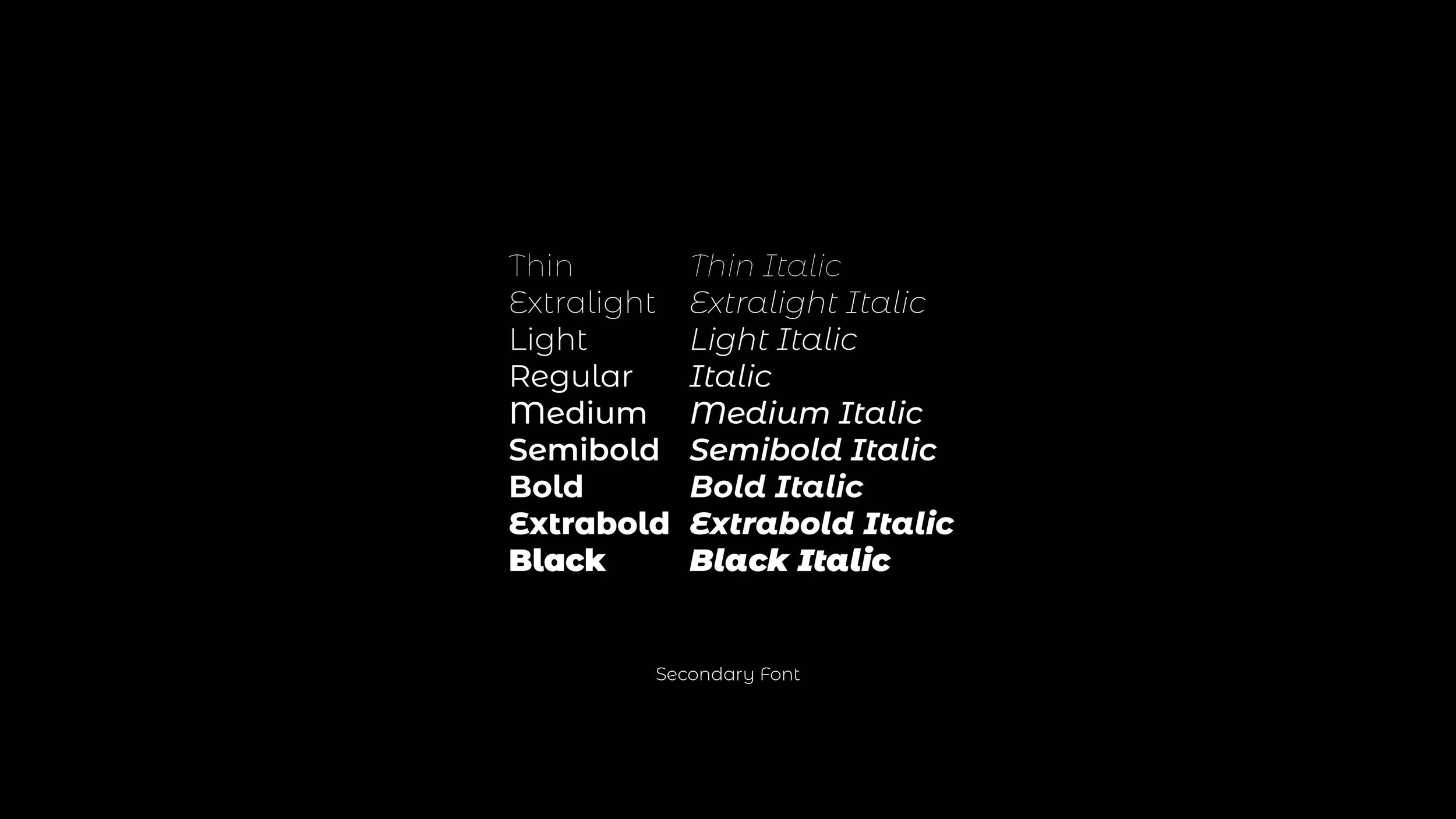
Typography played a key role in capturing the brand's tone. I paired Chlara, a modern serif with elegant ligatures and soft curves, with Montserrat Alternates for balance and readability. Together, they signal a beauty-forward, organic, and hand-crafted product.
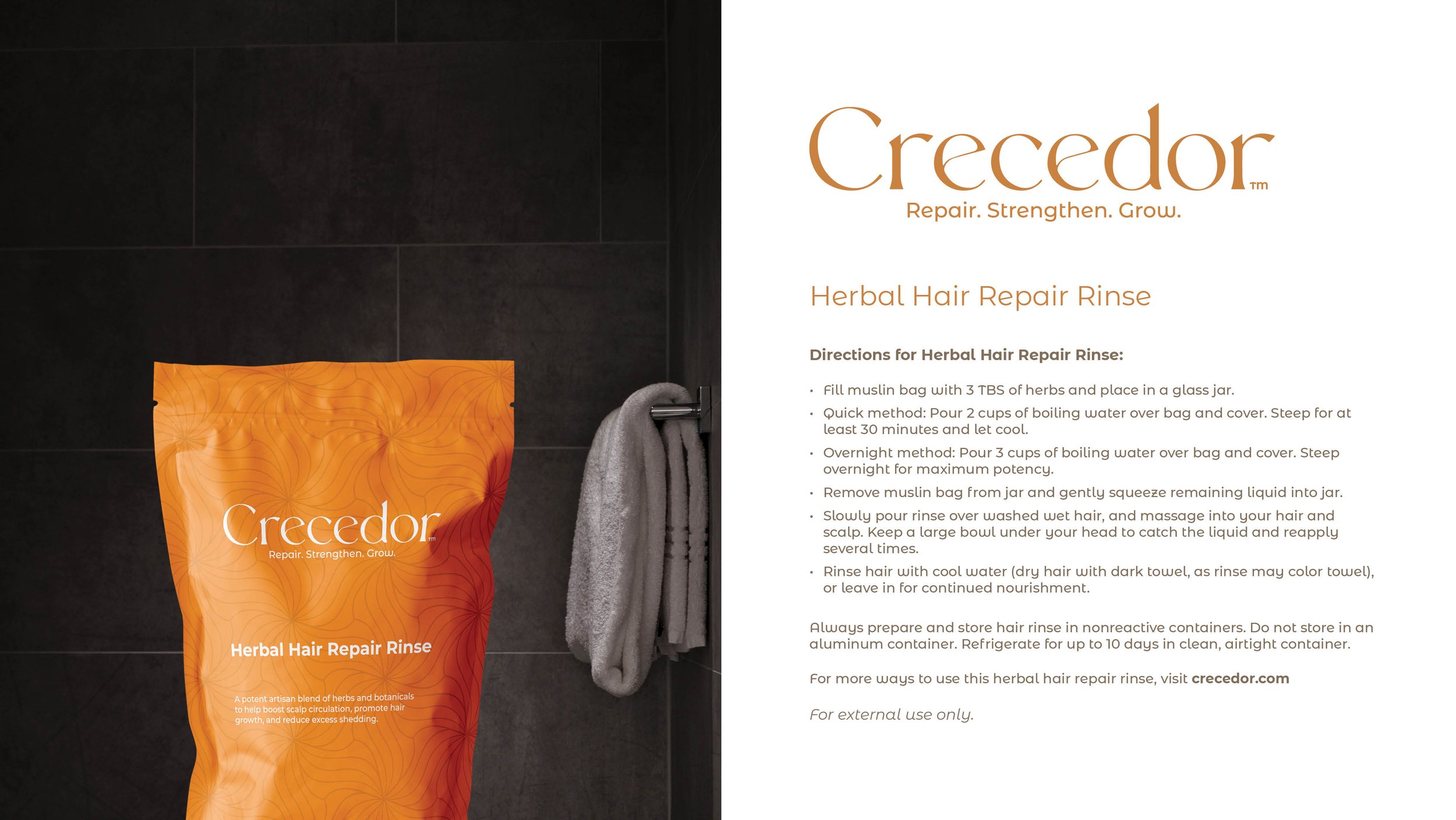
To enhance the packaging, a floral pattern adds depth to small-format packaging and is scalable for use across broader brand touchpoints, including print, web, and social media, and builds a cohesive brand experience for Crecedor.
Designed as Principal designer at Blackthumbnail Design.