Reintroducing Systems Unlimited, a refreshed brand identity that’s lived both inside and out.
After 50 years of dedicated service, Systems Unlimited has earned its place as a leading nonprofit in Eastern Iowa, empowering individuals with physical and mental disabilities through personalized, life-enriching support. Yet, despite its longevity and impact, public perception of the organization was blurred. Many assumed the name referred to a tech or IT company, an identity mismatch that signaled it was time for a change.
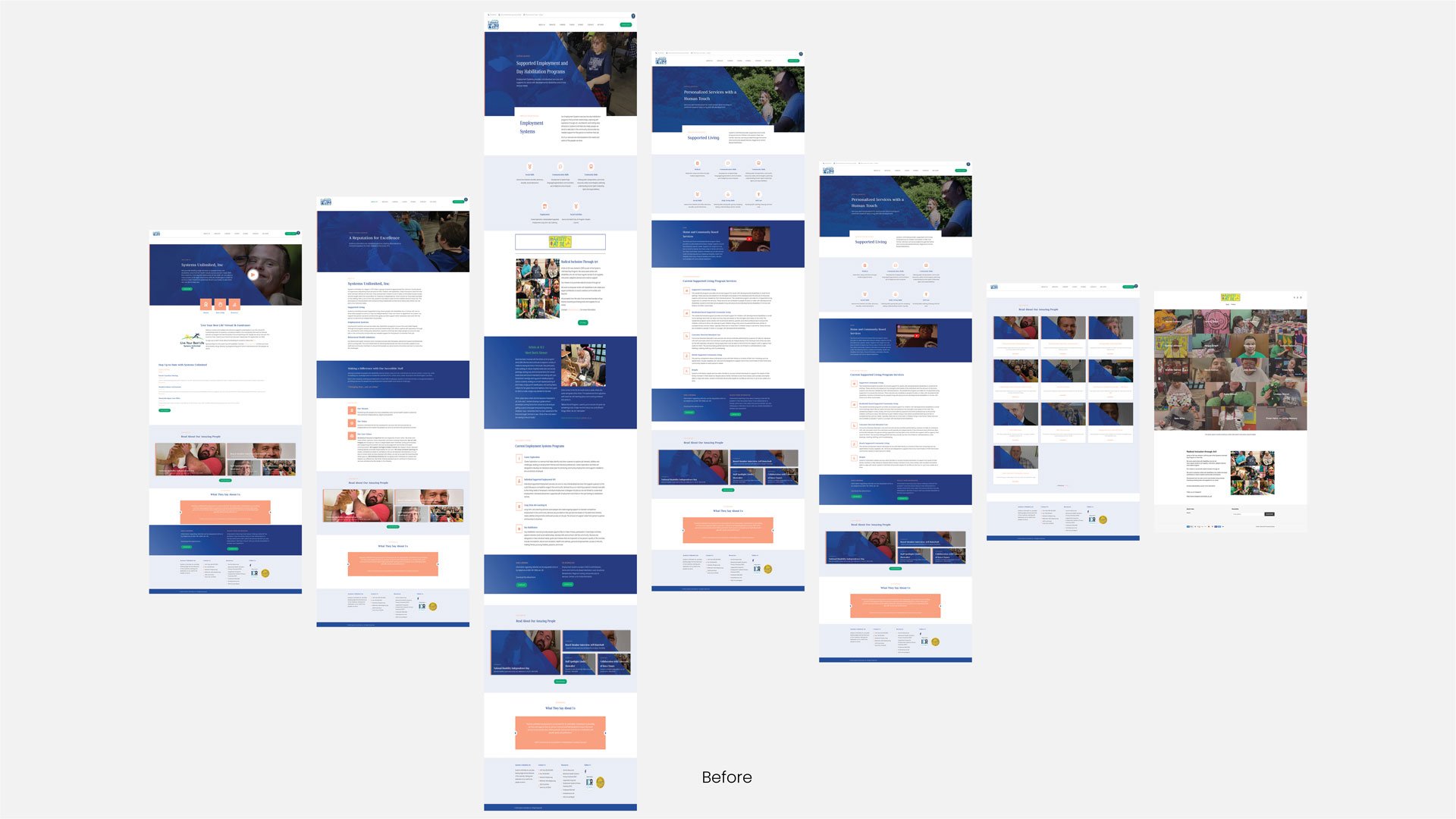
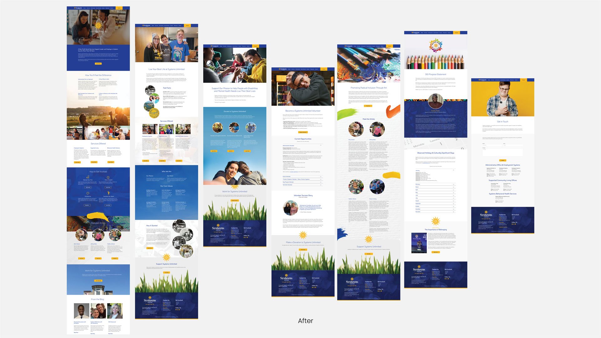
My challenge was to realign Systems Unlimited's outward brand expression with the heart of its mission. Through stakeholder interviews, internal workshops, and community insights, it became clear that the organization's strength lies in its people. Every interaction with staff radiated warmth, positivity, and purpose. The rebrand needed to reflect that humanity while addressing modern design standards, particularly the need for mobile adaptability and immediate visual recognition.
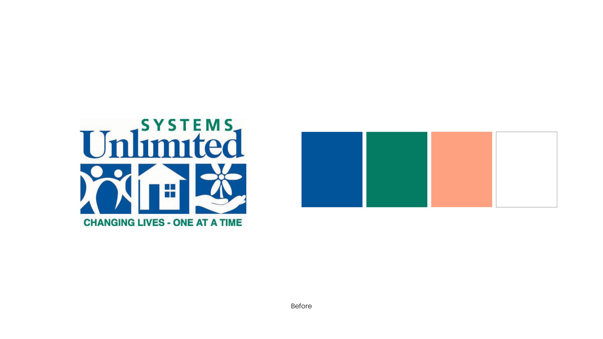
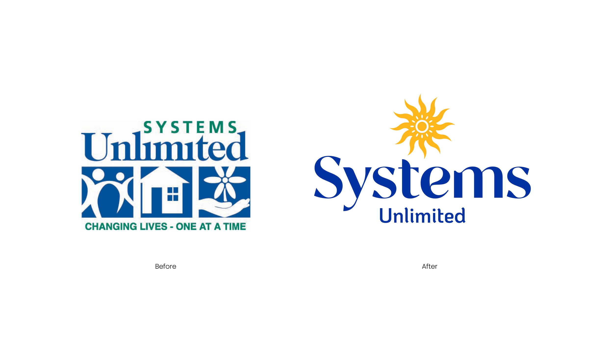
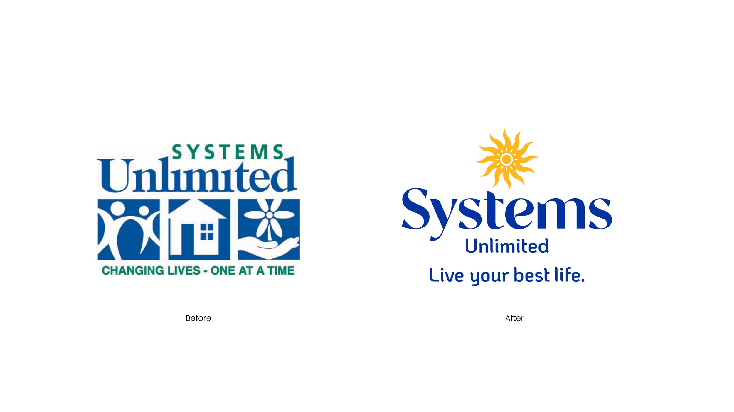
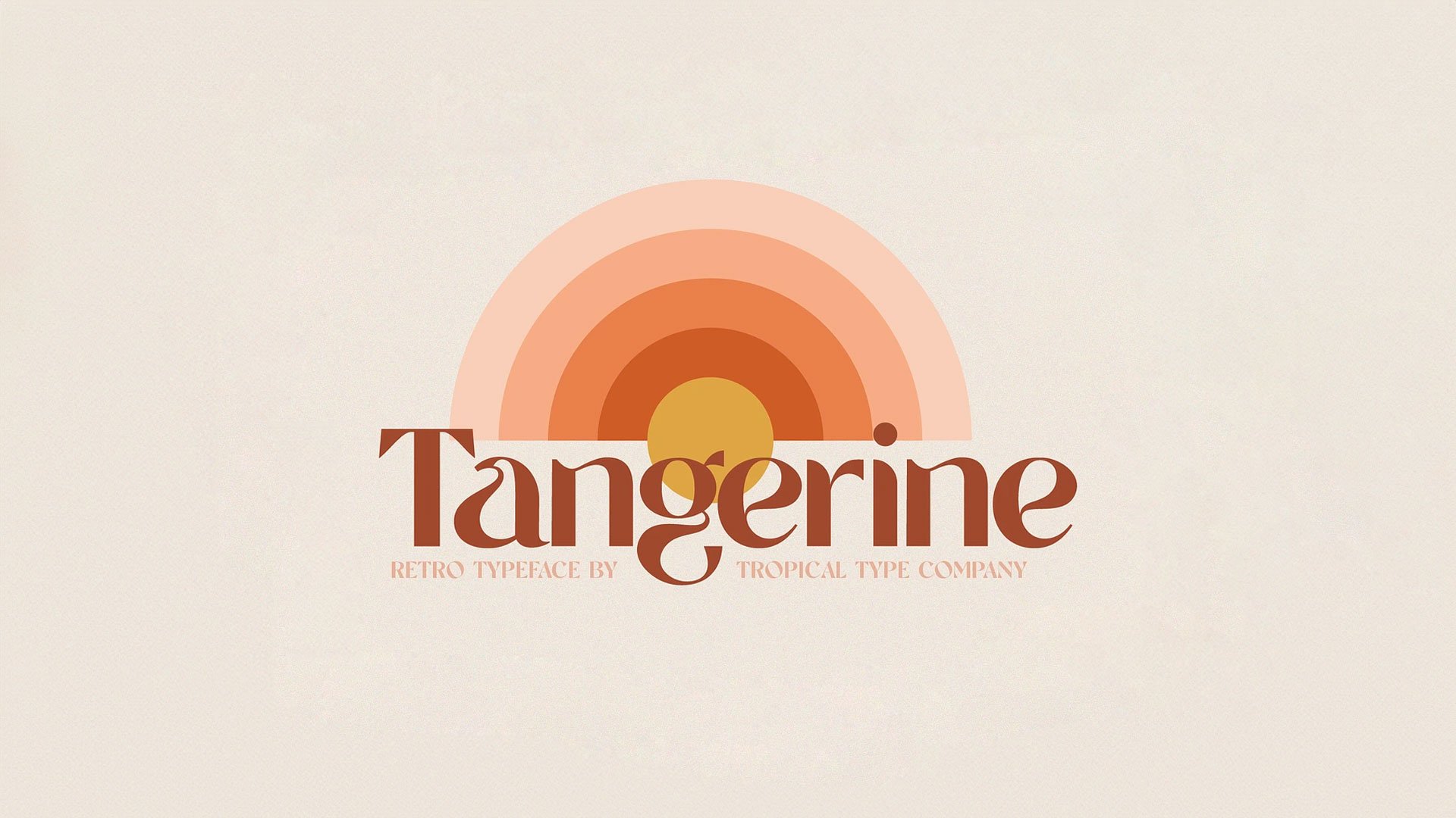
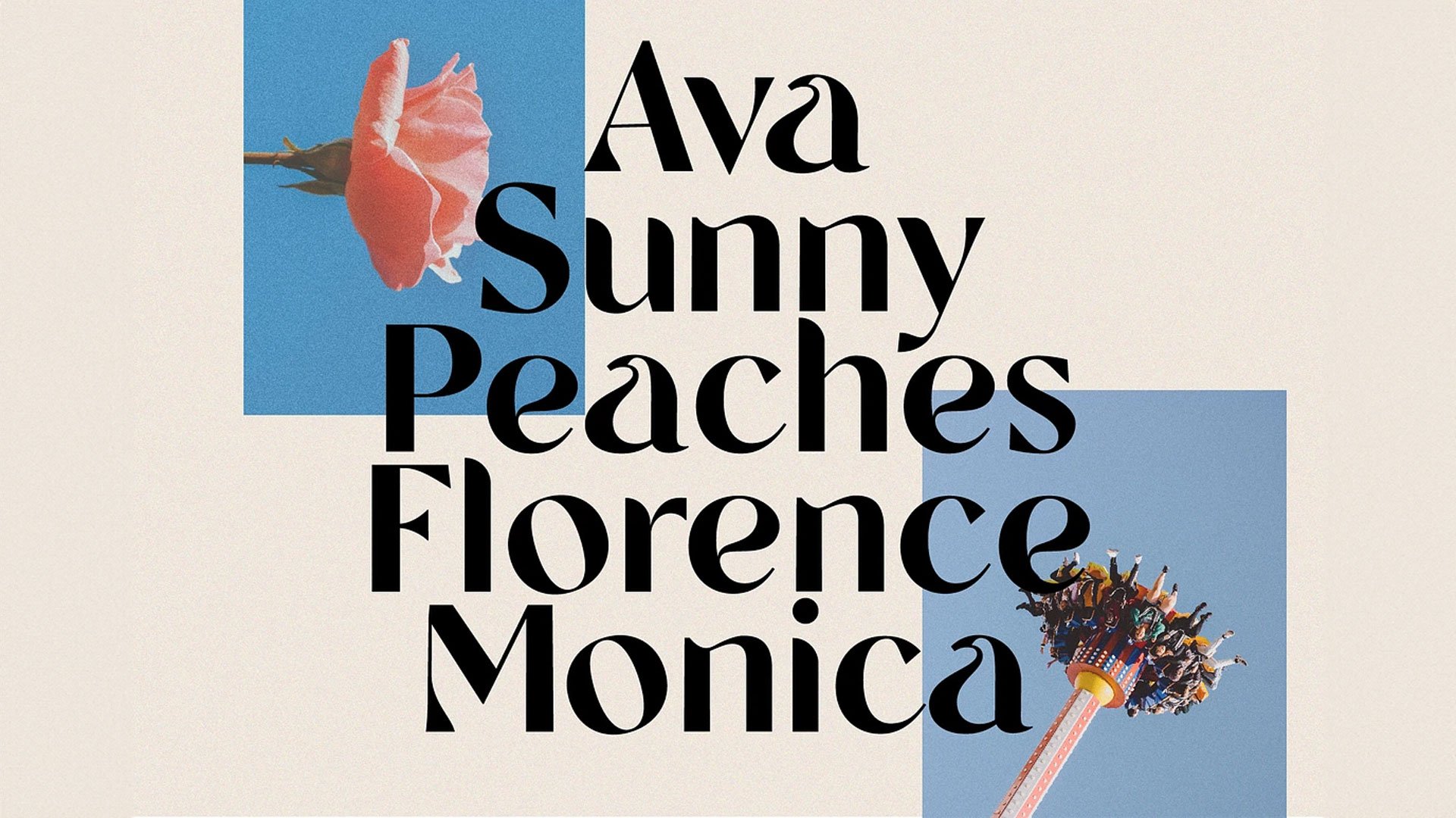
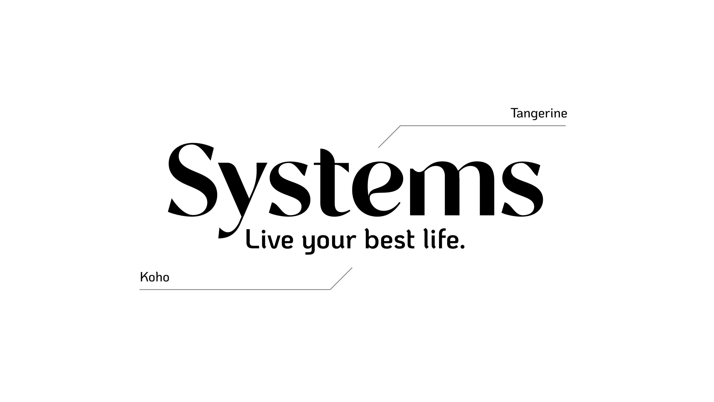
The previous logo, though well-meaning, combined symbols of housing, people, and flowers in a way that felt dated and lacked versatility. The new identity introduces a contemporary look with subtle nods to the 1970s roots of the organization, featuring retro-inspired letterforms that maintain a timeless yet friendly and approachable aesthetic.
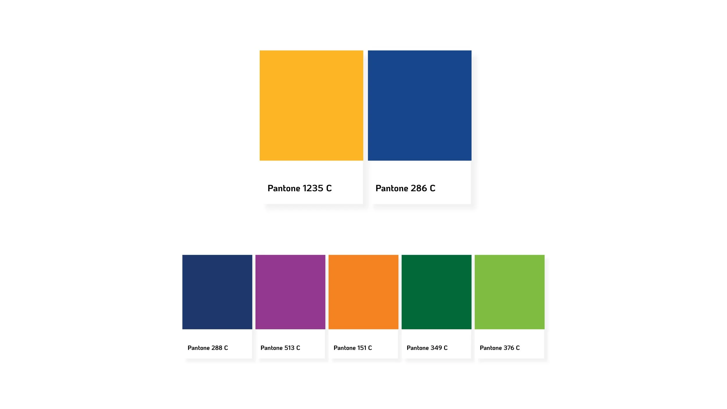
To bring this visual language to life, I introduced a bold, emotionally rich color palette: a deeper, more grounded blue paired with a sunny gold. At the center of the refreshed visual identity is a radiant sun icon, a symbol of joy, vitality, and growth. The sun energizes the brand's three pillars: the individuals served, the homes and communities that support them, and the staff who make it all possible. It represents life outdoors, natural light, warmth, and human connection. Whether it's the joy of dancing in daylight or the way sunlight warms a home, the sun becomes a powerful metaphor for the lives Systems Unlimited helps every day.
The new tagline, "Live your best life," encapsulates the organization's belief in individual potential. It speaks not only to those served but also to the dedicated team behind the mission. It's a unifying statement for recruitment, culture, and care alike.
Expansive lifestyle photography showcases the people at the heart of the mission, reinforcing the organization's optimism and authenticity. Lush green grass, open skies, and candid expressions create a brand that feels real, rooted, and hopeful.
This rebrand gives Systems Unlimited the clarity it lacked while amplifying everything that made it special to begin with. It's a new look, reflecting a 50-year legacy that's still growing, still caring, and still helping people live their best lives.
Work done as lead designer at Meld Marketing.