A family-owned, custom home and remodeling company refreshes their brand.
As licensed REALTORS® and award-winning builders, their expertise spans custom homebuilding, kitchen and bath remodels, roofing, siding, and more. Yet for over a decade, they operated without a cohesive visual system—no defined color palette, consistent typography, or a logo that reflected the elevated experience they deliver.
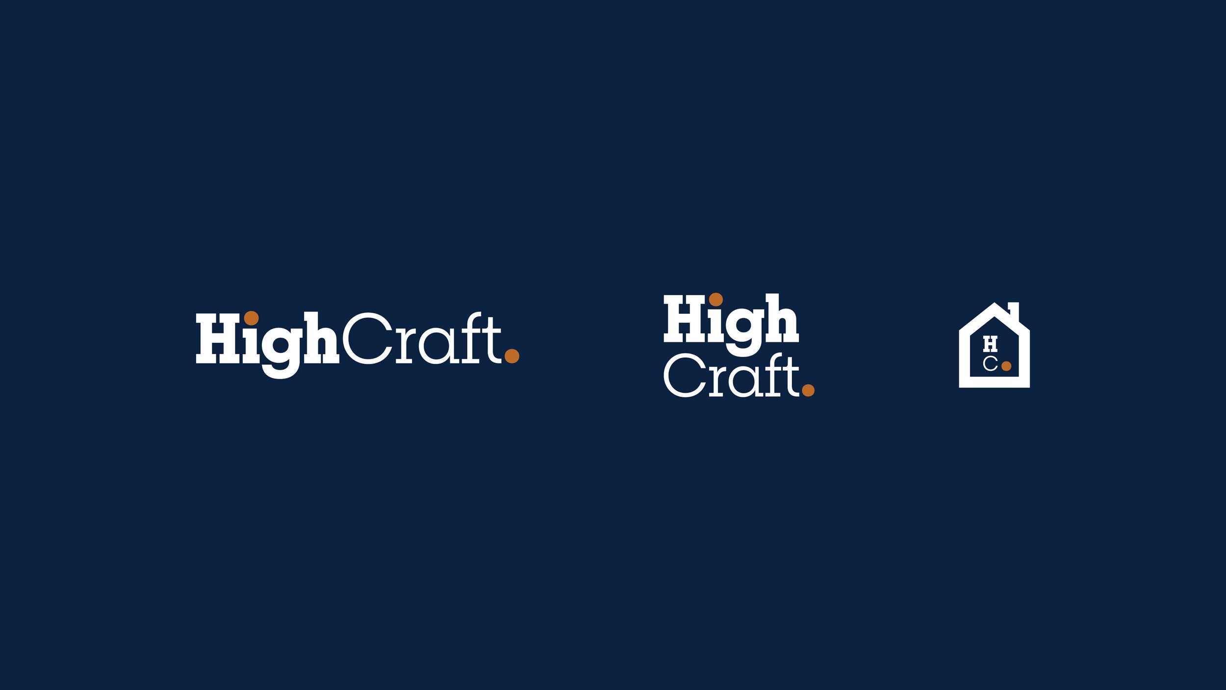
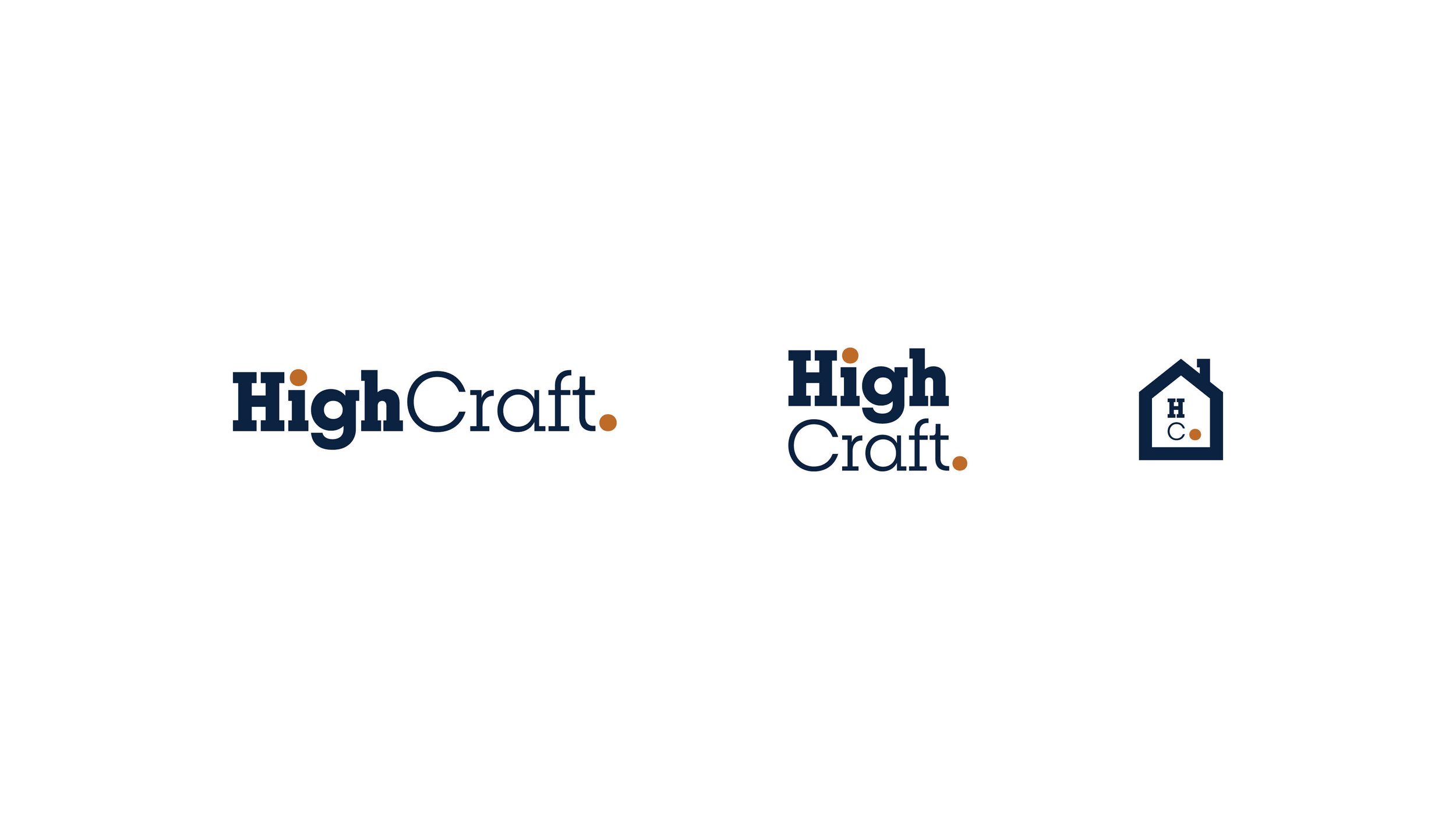
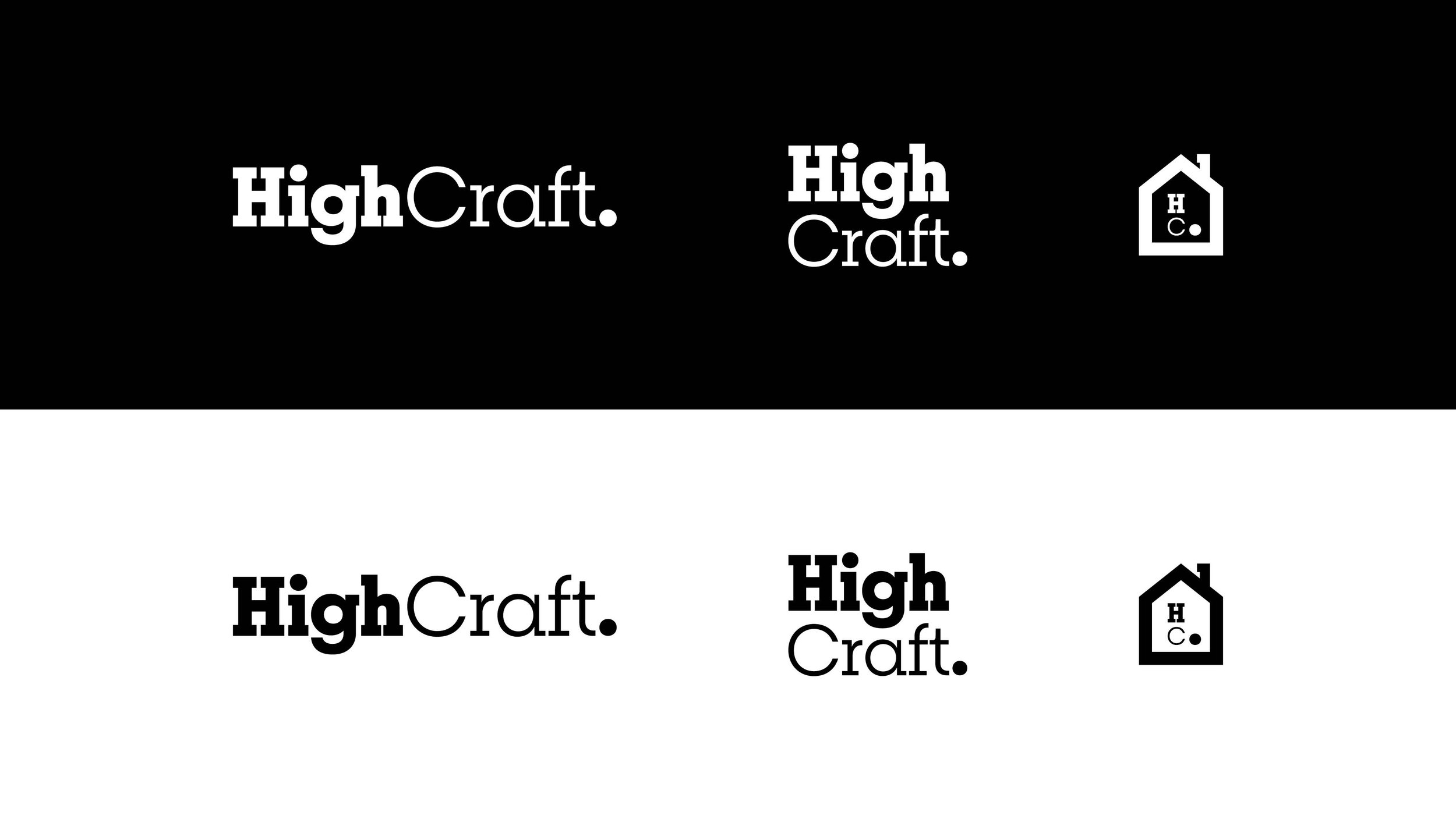
Their goal was to establish a visual identity that felt timeless and trustworthy yet still accessible and defined as approachable luxury. The new logo and icon were designed to express that balance. It serves as a clean, architectural mark that stands in stark contrast to their previous logo, which lacked the sophistication that the award-winning work they've come to be known for embodies.
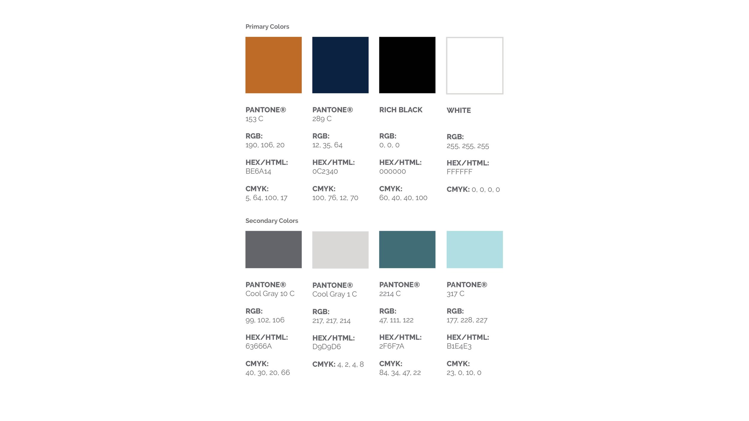
The new palette, anchored in a deep navy and a slate-toned orange, evokes both durability and warmth. For typography, I introduced Breton, a geometric slab serif. Its subtly rounded forms (seen in characters like "o," "c," and "e") echo the structure of architectural forms and are suited for value-conscious clients seeking high-quality design craftsmanship.
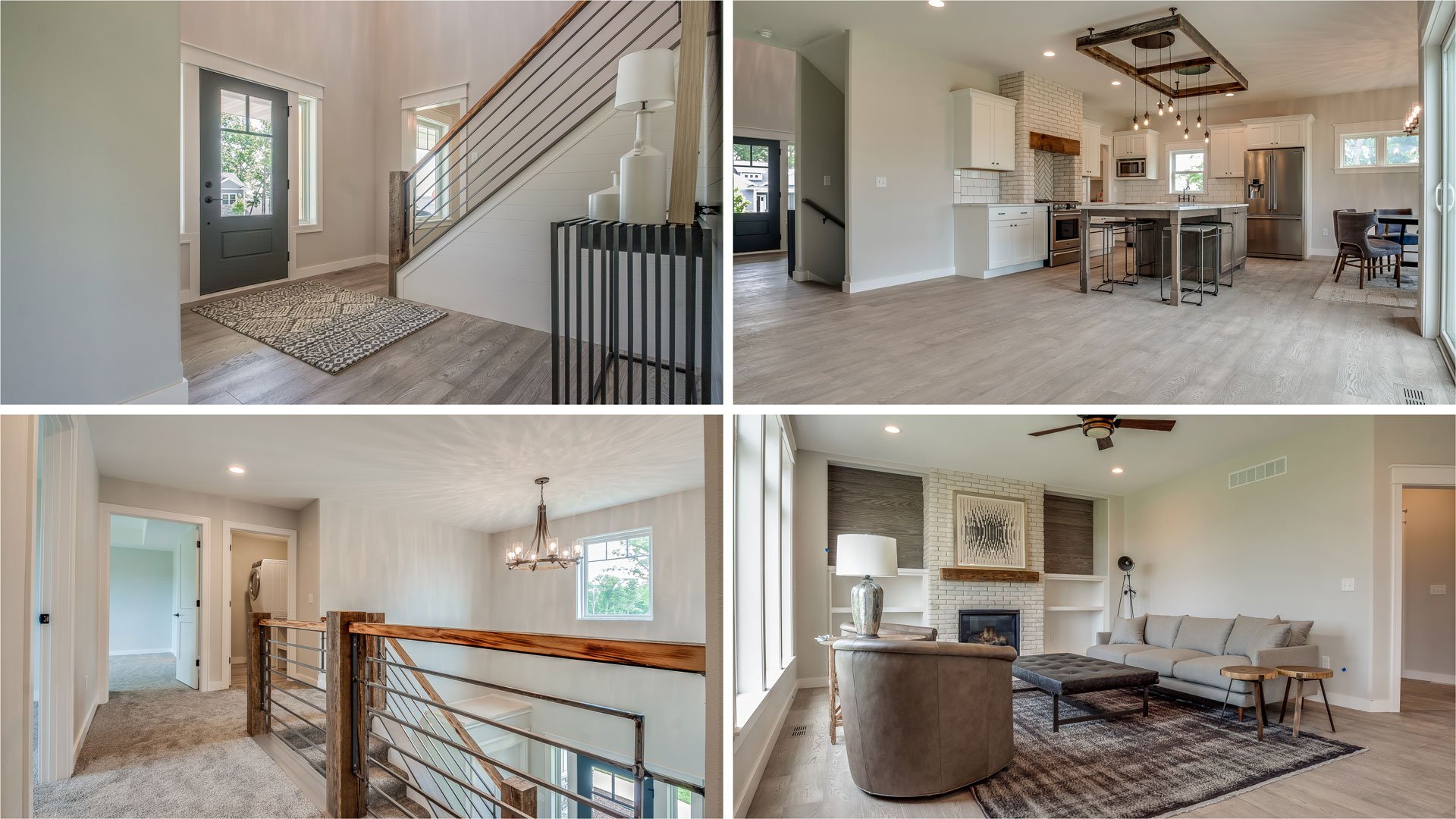
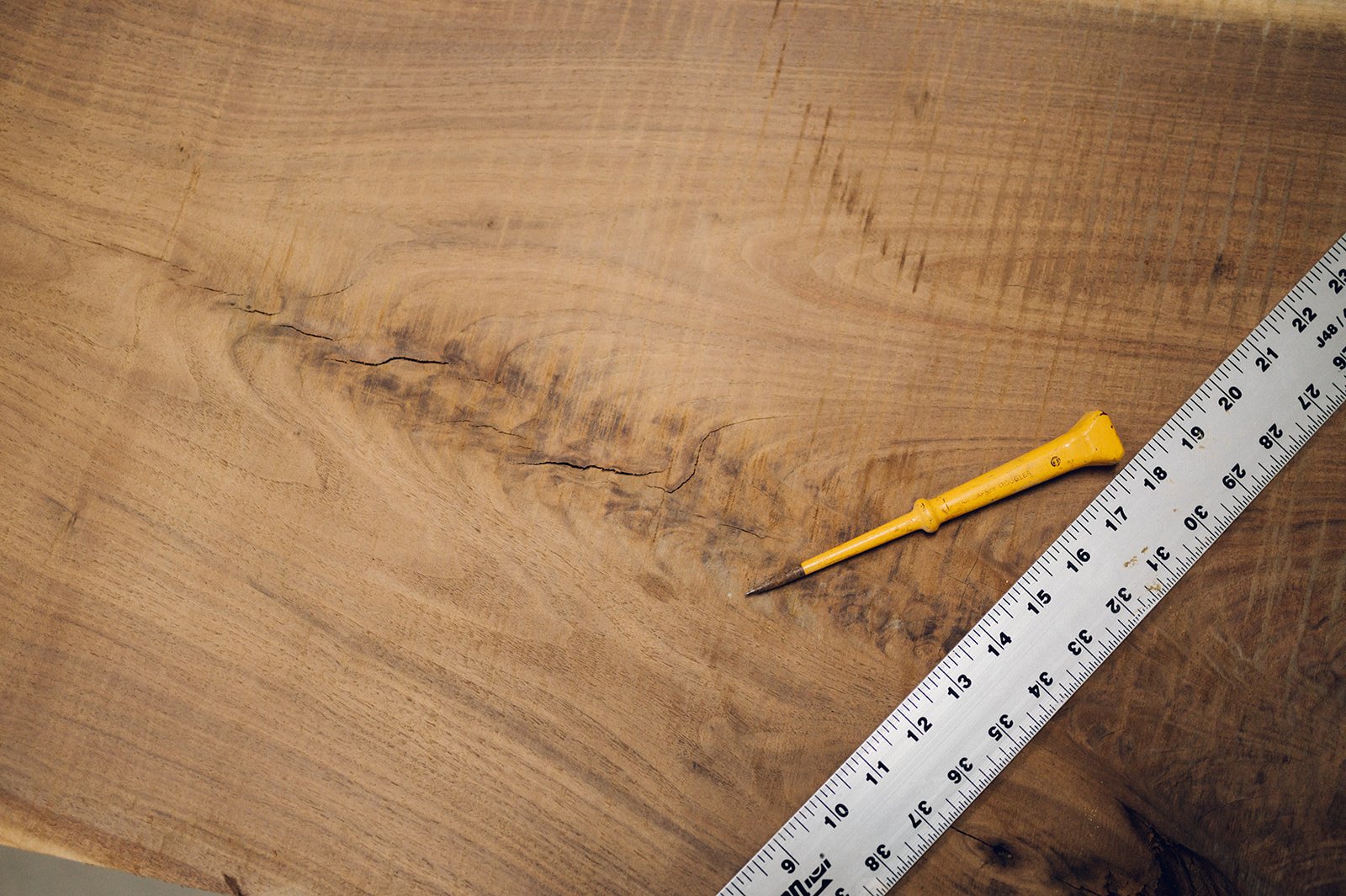
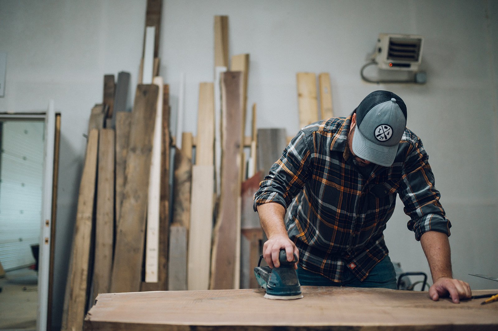
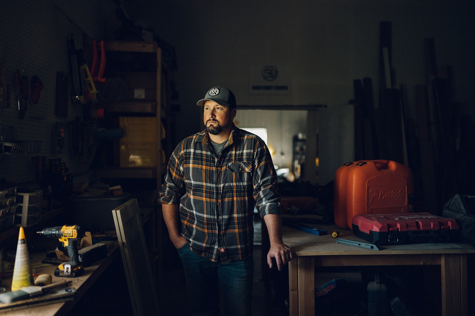
As art director for the brand's photoshoot, the Kilburg family shapes the look and feel of the website and social platforms. Every visual decision, from layout and lighting to wardrobe and materials, was made to reflect the new High Craft brand: family first, human, high-end, and built to last.
Work done as lead designer at Meld Marketing. Photography by DJ Freesmeier.