Redesigning Collective Data’s digital presence was about more than aesthetics, it was about uncovering and elevating a strong, but under-communicated story.
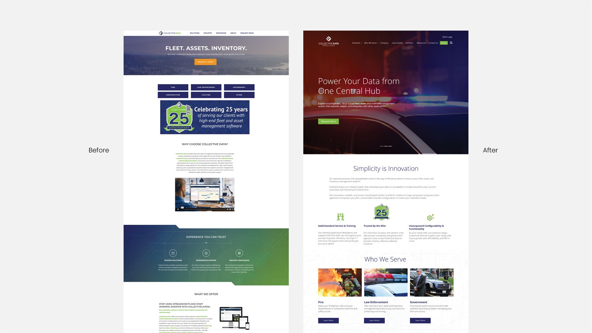
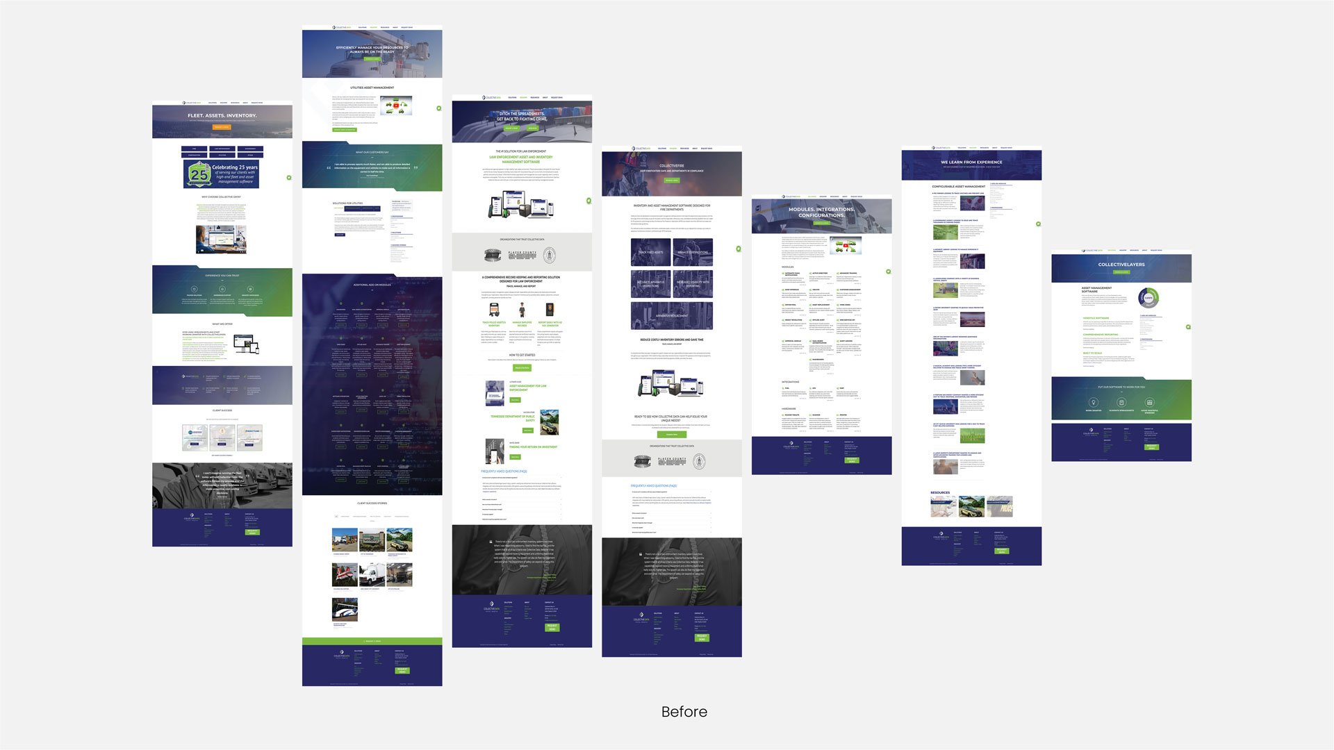
Collective Data’s previous website didn’t reflect the power or clarity of the platform they’ve built. Navigation was clunky, messaging was diluted, and the visual hierarchy made it difficult for users to find what they needed, let alone take action.
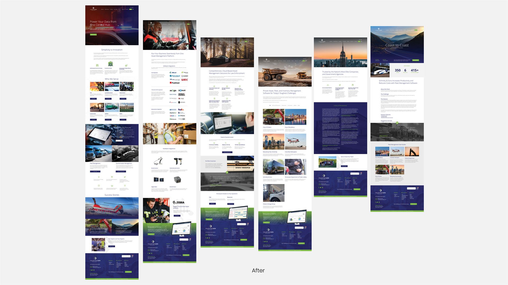
Through a collaborative process grounded in design strategy, I led the effort to restructure the site, focusing on clarity, usability, and brand integrity. I walked the client through key UX and UI principles, reducing blocks of centered text, refining all-caps headlines, and streamlining calls to action.
One of the biggest wins was redefining how brand colors function on the site. Green, previously scattered, was reimagined as a primary call-to-action color, anchoring “Schedule a Demo” buttons with purpose and consistency. Google’s material icon library introduced a sense of cohesion across complex content types. At the same time, edge-to-edge photography added both scale and humanity, visually connecting users to the powerful software driving fleets for law enforcement, government, construction, and city agencies.
Staying true to their existing brand framework, I rebalanced their typography and color palette to achieve better hierarchy, legibility, and flow. I introduced a new tagline, an evolution of their previous one: “Intuitive. Productive.” to “Simplicity is Innovation,” which helped distill the brand messaging into something bold, clear, and memorable.
The redesign isn’t just aesthetically more visually appealing. It’s also more functional. Users can now find what they need faster, understand the value more clearly, and engage with the brand more intuitively.
Created as lead designer at Meld Marketing